Common mistakes that designers make
All designers make mistakes. Here are the most common, and how to avoid them.
All designers make mistakes. Here are the most common, and how to avoid them.
Although we don't like to admit it later on in our careers, when we start making our way as designers, we make a lot of mistakes. Once you're working in a creative agency you quickly learn that there are a lot of things you should not do.
Here I've compiled a list of common design mistakes for you to be aware of. Although I've committed most of these crimes myself, I have learned from them and hopefully they can help you too...
01. Not understanding the brief
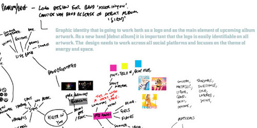
Get as much detail about what the clients wants and needs, as early on as possible
Without a clear idea of what the client wants you can end up making matters complicated for yourself. A lot of time can be wasted procrastinating, or working up design ideas that may not be relevant to the client's needs.
Instead, you need to read and understand the brief carefully from the start, make notes, brainstorm and try to keep in contact with the client to ensure that what you are working up is heading in the right direction.
02. Using the wrong typography
There are lots of places to download free fonts but be aware of the potential pitfalls in terms of legalities and usage rights, which may leave you having to restart your work with a new font. If you're doing professional work, don't shy away from the idea of paying for professional fonts.
As well as deciding where to get your fonts from, your typography choices are equally important. It's not just amateurs who fall foul of this – for example, the movie Avatar was criticised for its title face, which looked very similar to the terribly overused system font Papyrus. Obviously Avatar had a few other things going for it that helped it rise above criticism of its typography, but your project may not be so blessed!
03. Font overload
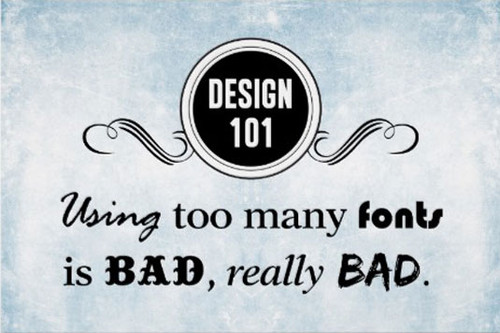
Too many typefaces can look cluttered and confusing
Having a clear, formatted design is crucial and so it's important not to use too many different fonts within a piece. You want your type to look consistent so don't confuse the viewer by layering your page with lots of varied typefaces.
As a general rule, try to stick to two different fonts and use the different font weights to differentiate and highlight areas.
04. Using too many stock images
Stock imagery can be very helpful to a designer, especially when you can't afford to hire a professional photographer. However, certain stock photographs seems to do the design circuit, especially within digital art, and can become overly familiar.
Try to avoid using stock model images as a central focus for your work because if you think it's a good photograph then it's more than likely others will too. It would be a shame if you produced a beautiful design only to find someone is using the same image in another design, taking the shine and originality off yours.
05. Not saving files correctly
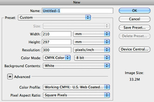
In general, save your designs as CMYK for print, RGB for web
Knowing how to set up your files correctly from the start is vitally important. There are many things to consider depending on the output of the work.
Print work is generally set up as CMYK and at 300dpi, whereas work for the web should be RGB (resolution will depend on your client's needs regarding mobile, Retina etc). Remember to consider bleed, trim and safety areas. Before sending to print, think about your file formats, outlining fonts and colour profiles.
This may all seem like a lot to take in but learning these processes will save you time in the long run, ensuring your work is reproduced correctly and keeping the client happy.
06. Failing to proofread
Using the spellchecker is great for finding misspelled words within your work but it won't catch correctly spelt words in the wrong context. For example, one of the most common mistakes is to confuse 'your' and 'you're', but spellcheck won't be able to help you with that. This is just one reason why you must always proofread every piece of your work (and ideally, get others to check it too).
07. Working destructively
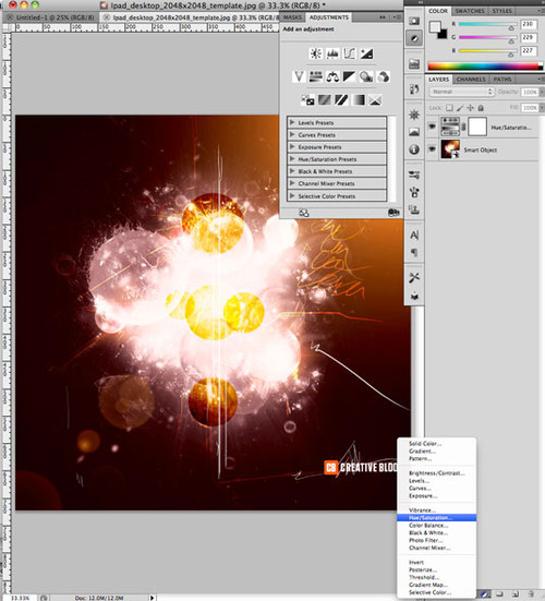
Work in a way that means you can edit individual elements later if necessary
'Working destructively' means making permanent adjustments to the pixels within your projects without being able to go back and re-edit things later.
To avoid this situation, try using layer masks instead of the eraser tool. Become comfortable using smart objects rather than rasterized layers and make use of adjustments layers. And try to ignore the standard adjustments from the image drop down menu in the toolbar.
8. Not considering context
Whether you're designing an icon, a logo or any other design element, these days you'll need to make sure it's transferrable across a range of different mediums - both analogue and digital. So you'll have to make sure that the colours, size and overall design will work on printed materials such as signs and T-shirts, as well as across various technology touchpoints such as desktop computers, mobile devices and more.
9. Poor use of QR codes
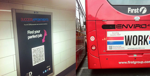
Think about how practical it will be for people to scan your QR code. Image courtesy of http://www.creativeguerrillamarketing.com
QR codes are popular and can be effective when used properly. But that's often not the case.
Think about where the QR code is going to appear; for example, will it be easy to scan? (If it's on the side of a moving vehicle, the answer is no!) Will your target audience need internet reception to decode it? (They won't have any, for example, on the London Underground.) As with all design, with QR codes it's all about context.
10. Slavishly following logo trends
Choosing to design your logo based on current trends is likely to leave your logo looking dated and out-of-touch as soon as the trend dies out, not to mention making you look slightly amateur. Rather than choose the popular flavour of the month, think about what's more likely to have longevity for your brand.
For example, the current logo of the BBC (shown below) has been around since 1997, yet still has not become dated.
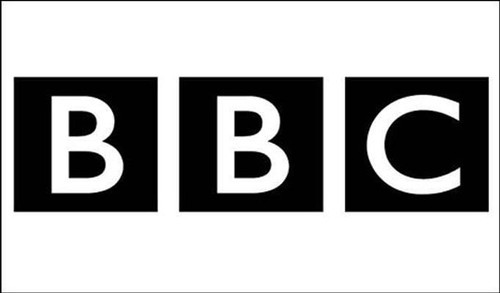
The current BBC logo is almost 20 years old and still looks fresh
Perhaps the biggest mistake you can make as a designer is to miss the entire point of design itself. Once you get your head round that, everyone else should follow...
Thanks to creativebloq