Hot web design trends from 2015
In 2015, web design moved away from information overload to an aesthetic revolving around empty space and simplicity.
The loudest content medium out there has finally learned how to be quiet. In 2015, web design moved away from information overload to an aesthetic revolving around empty space and simplicity. Taking a cue from magazines, web pages are using large high-definition photographs and typography to lure in readers with eye-pleasing openers before revealing further content.
This design is influenced by a new appeal to simplicity and by the need to cater to mobile web traffic, which is increasing every year. In the face of this push to cut away excess, here are 14 design trends that have reared their heads so far in 2015.
1. Minimalism
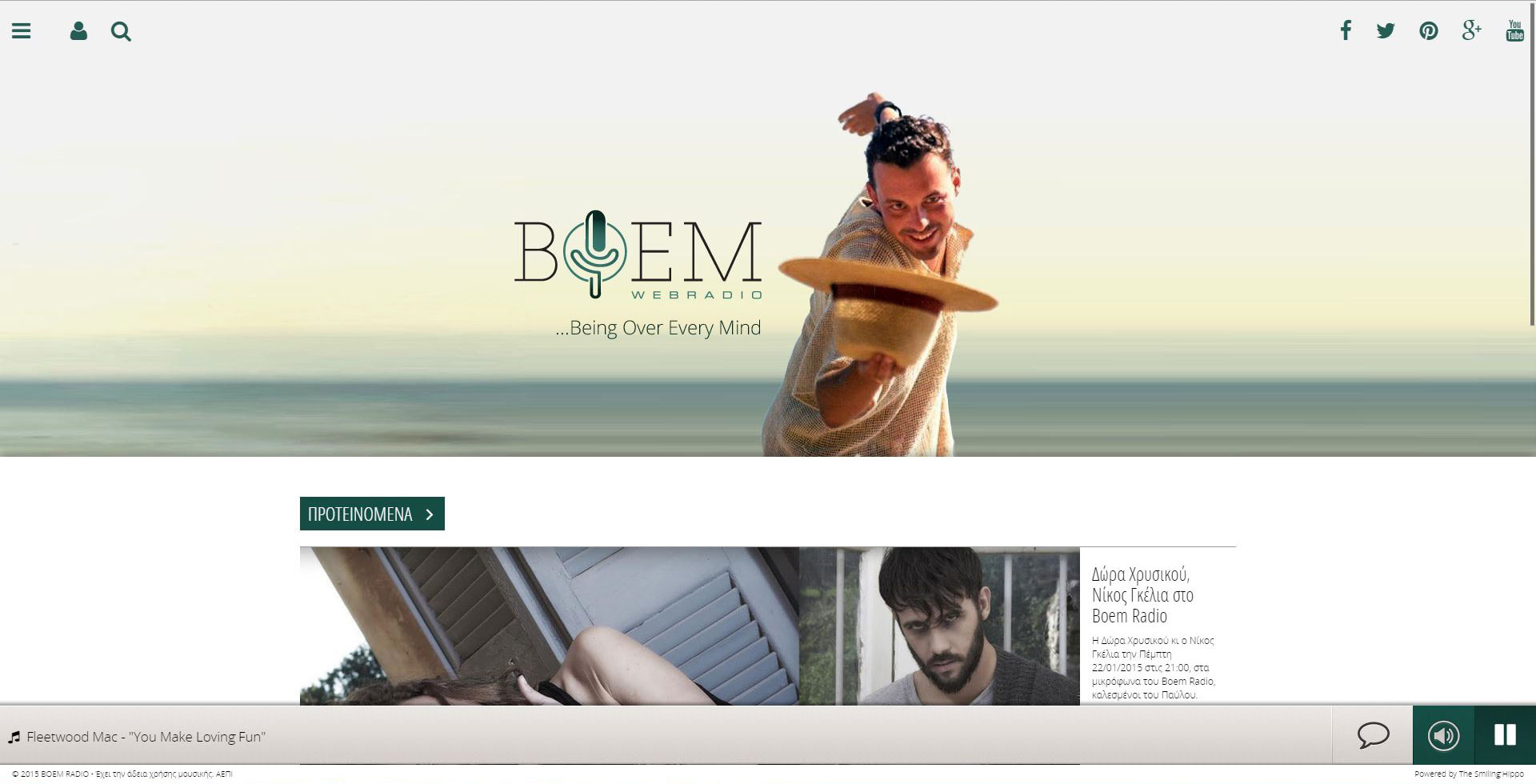
From simplifying logos and typefaces (here's looking at you, Google) to cleaning up entire web pages, minimalism is the trend influencing all others. Websites are focusing more on their actual content and reducing all of the clutter around it. Footers, sidebars and borders are all disappearing, and even color palettes are being simplified as companies emphasize one dominant color in their visual design. Boem Webradio logo is a perfect example of this trend.
2. App-like menus
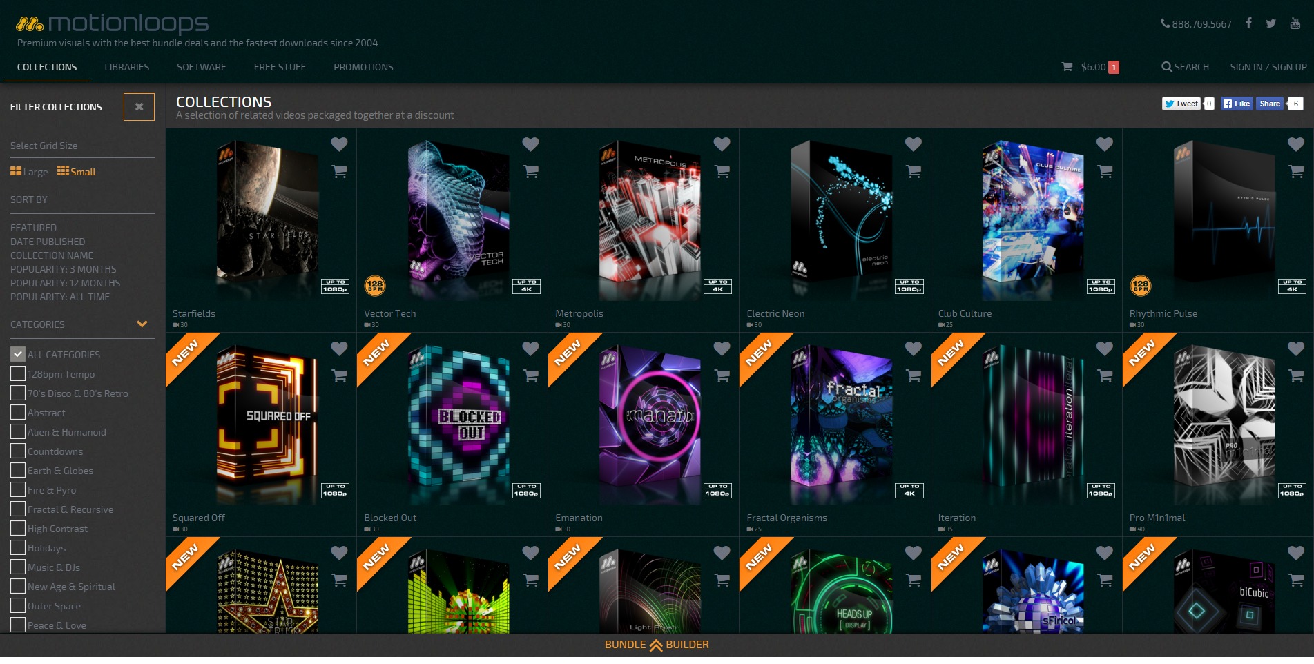
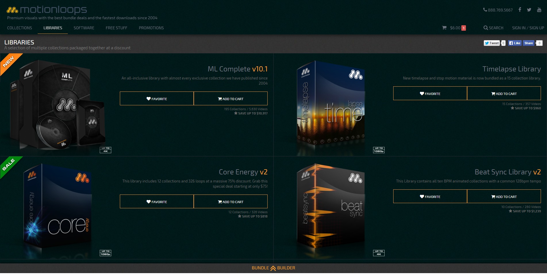
Designing with the mobile market in mind changes more than just aesthetics. It has impacted the way web illustrators think about organizing their content and how they let readers access it. Sticky menus and sidebars are falling out of favor to make room for content that readers actually want to see. These days, menus are at the top of the screen and are mostly hidden, noted by a single icon (often a stack of three lines called a “hamburger”) that when selected drops down or slides out into a more robust menu. Motionloops company has a beautifully simple example of this style of menu.
3. Ghost buttons
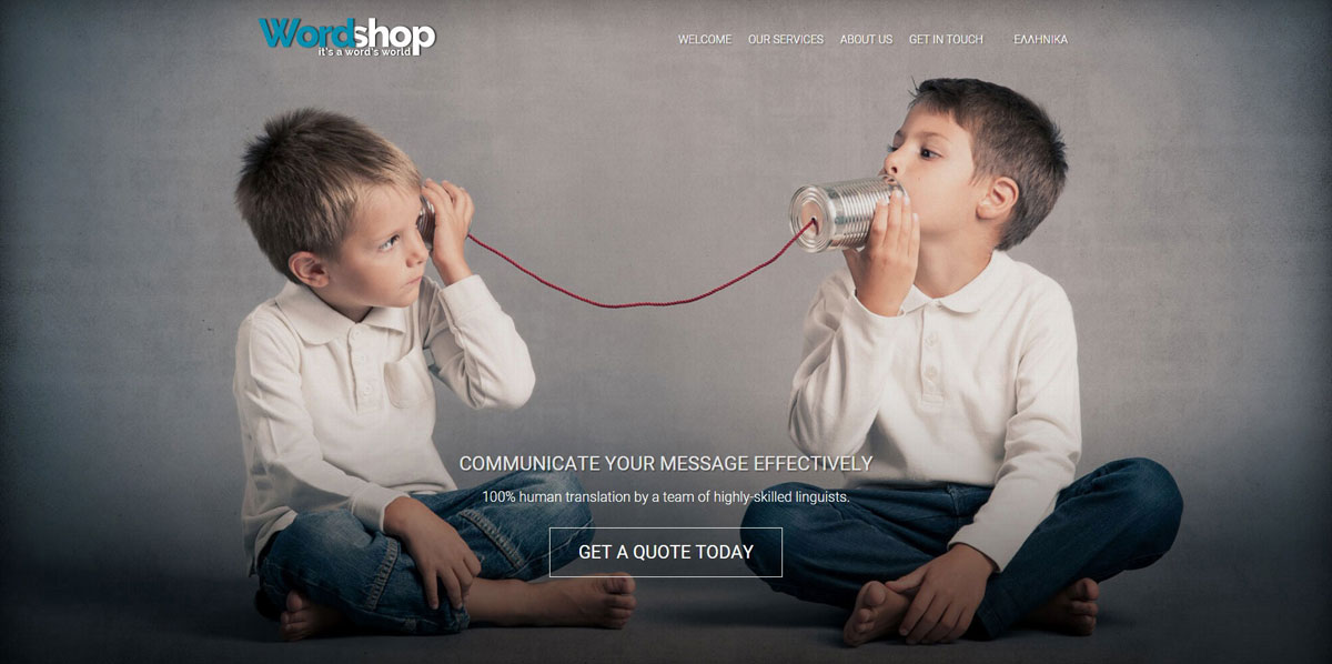
Web sites are moving away from loud, flashy buttons, and are embracing transparent buttons. Because they are less obtrusive, ghost buttons help sites highlight more of the content they want audiences to actually see instead of call-to-actions they would otherwise force users to click. Ghost buttons include only the outline of a button (no fill) along with a word or two in simple typography in the center. Wordshop, features a prominent ghost button on their landing page.
4. The reign of the hero Image
Already trending in 2014, the hero image hasn’t gone anywhere this year, but it has evolved. Last year, sites all over the web included the standard hero image: a high-definition (HD) picture featured prominently at the top of a website that stretched the entire width of a user’s browser window with only a few words of text overlaying it.
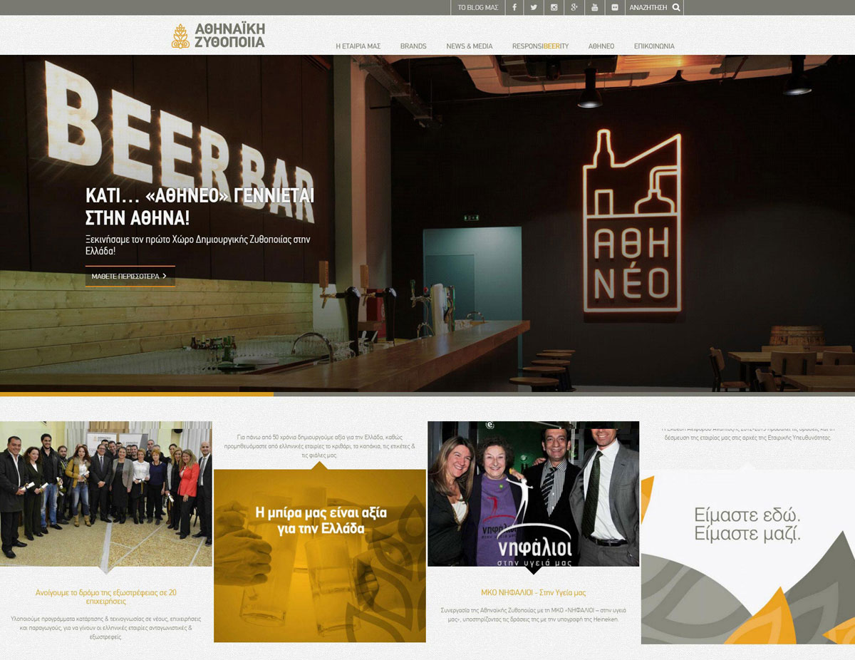
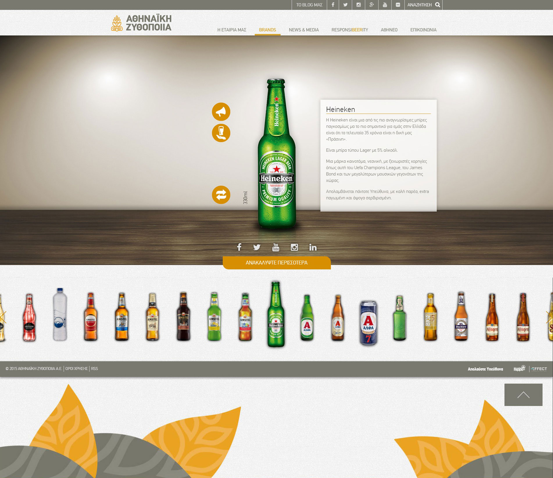
This year the hero image has changed in a few remarkable ways. Some sites have taken the HD photo one step further and embedded HD video onto their landing page. Others pursued the opposite route: blurring the banner photo or removing it altogether in favor of a simple colored background to draw attention to the text. Athenian Brewery’s site shows a blend of these trends, offering an image on one half of the page but leaving plenty of white space for its heading.
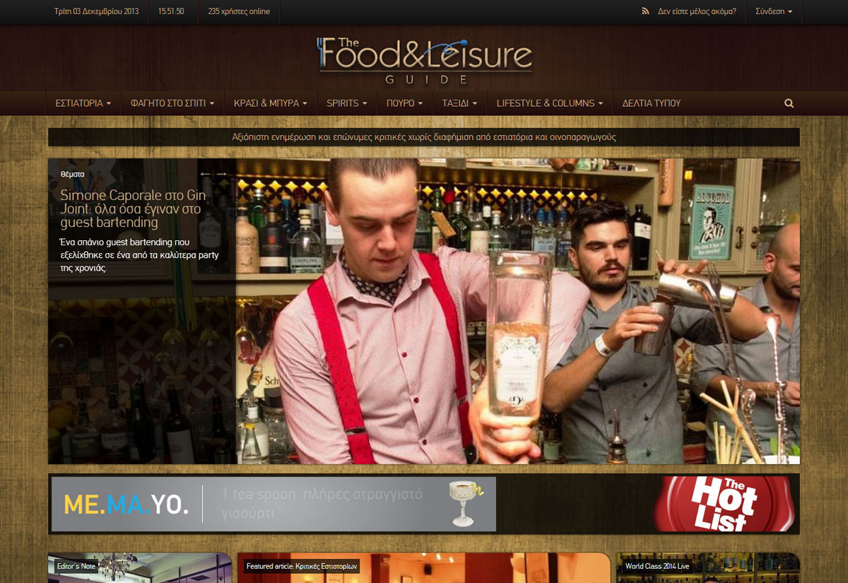
5. Interesting typography
When the hero image became popular, designers began paying more attention to typography. Picking an engaging font is crucial to drawing a visitor’s attention when so much of the site’s content is simplified and reduced as an effect of minimalism. Food & Leisure uses custom typography on its website and features a powerful statement without any other distractions to spotlight its message to audiences.
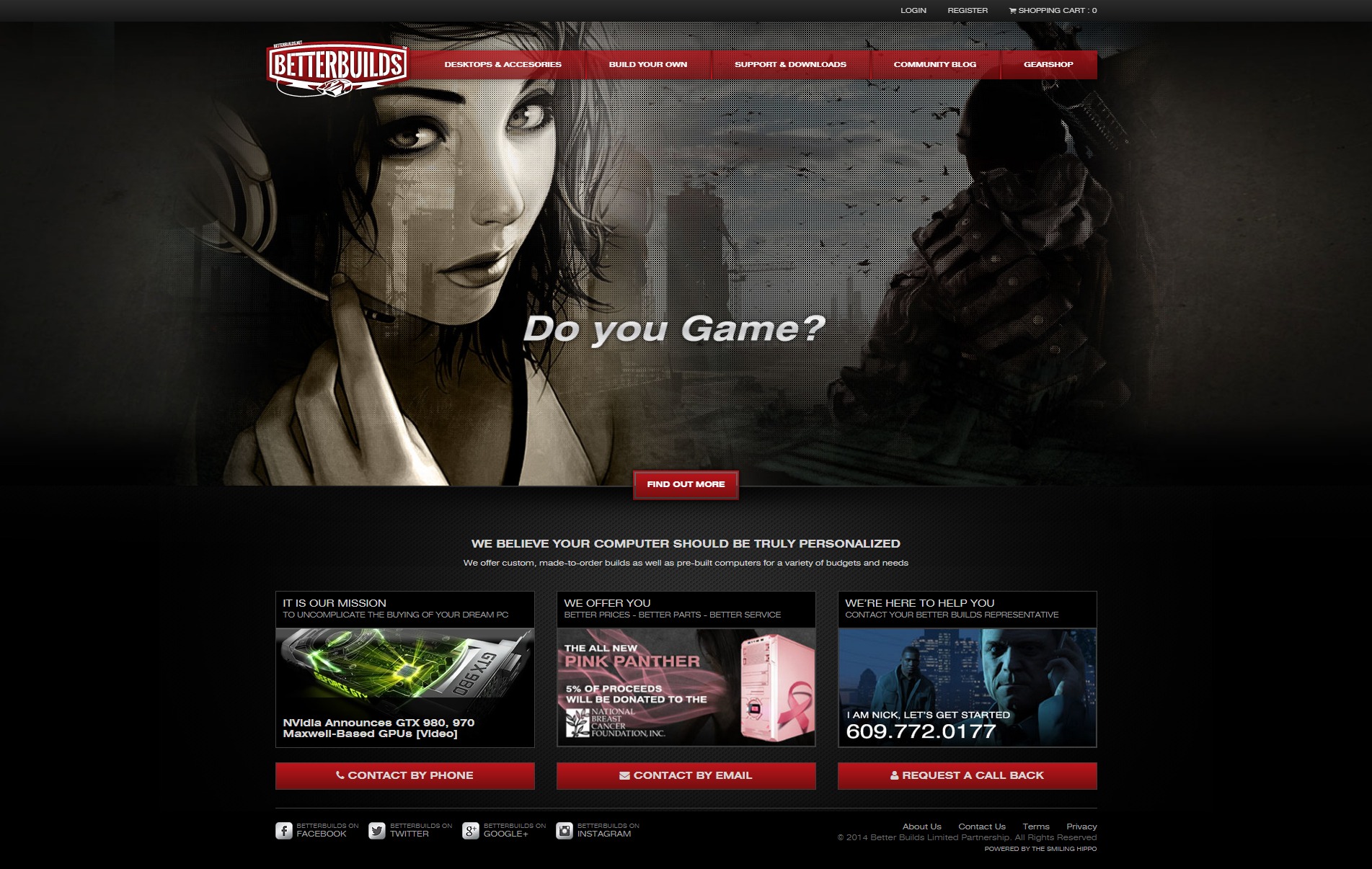
6. Stock photos that don’t look like stock photos
The days of the generic stock photo are over (thank the photography gods); jaw-dropping visuals are in. For example, Better Builds is a website no longer looking like the result of an uncoordinated stock photo shopping spree. Now, they actually feel genuine.
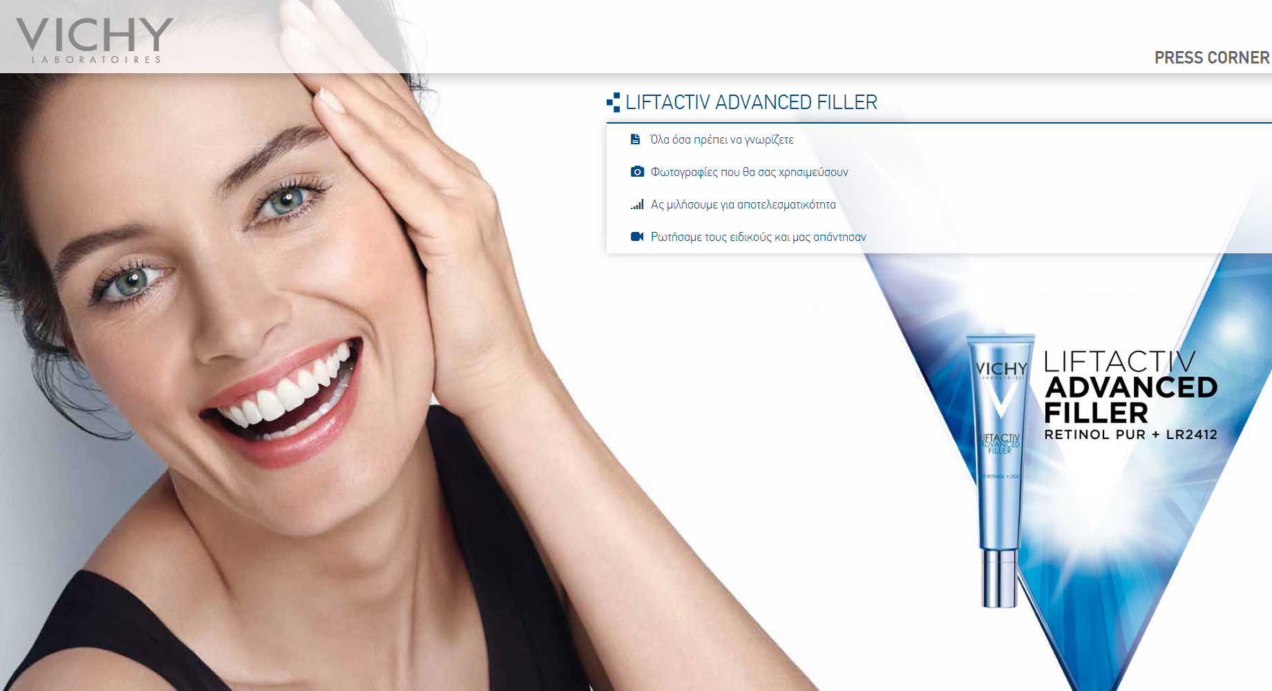
7. Single page design
Nobody wants to click through multiple pages anymore. Instead, users prefer to scroll through content on one long page. This trend too has its roots in mobile web surfing because it is far easier to scroll down with your thumb than it is to click through multiple pages and wait for each to load. This year has reinforced that concept, and while few websites are only a single page, most are reducing the number of pages they have and lengthening the content on each to be more mobile-friendly. Vichy Presscorner website is a great example of Single page design.
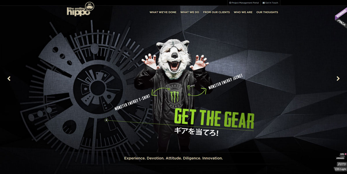
8. Parallax scrolling
A way to make websites more engaging, parallax scrolling creates a three-dimensional illusion that draws audiences into a site’s content. Many brands now use parallax scrolling to create a more immersive effect for visitors. The Smiling Hippo uses this technique brilliantly.
9. Modular design
Call it a grid, tiles or cards, each of these designs creates the same effect: organizing content in an efficient, aesthetically pleasing way. A single column of content is inefficient and less user-friendly by comparison. Modular design allows a page to show more content to users faster, in a way that makes more intuitive sense and creates a more visually engaging layout at the same time. Motionloops offers a textbook-perfect example of good modular design.
10. The evolution of flat design
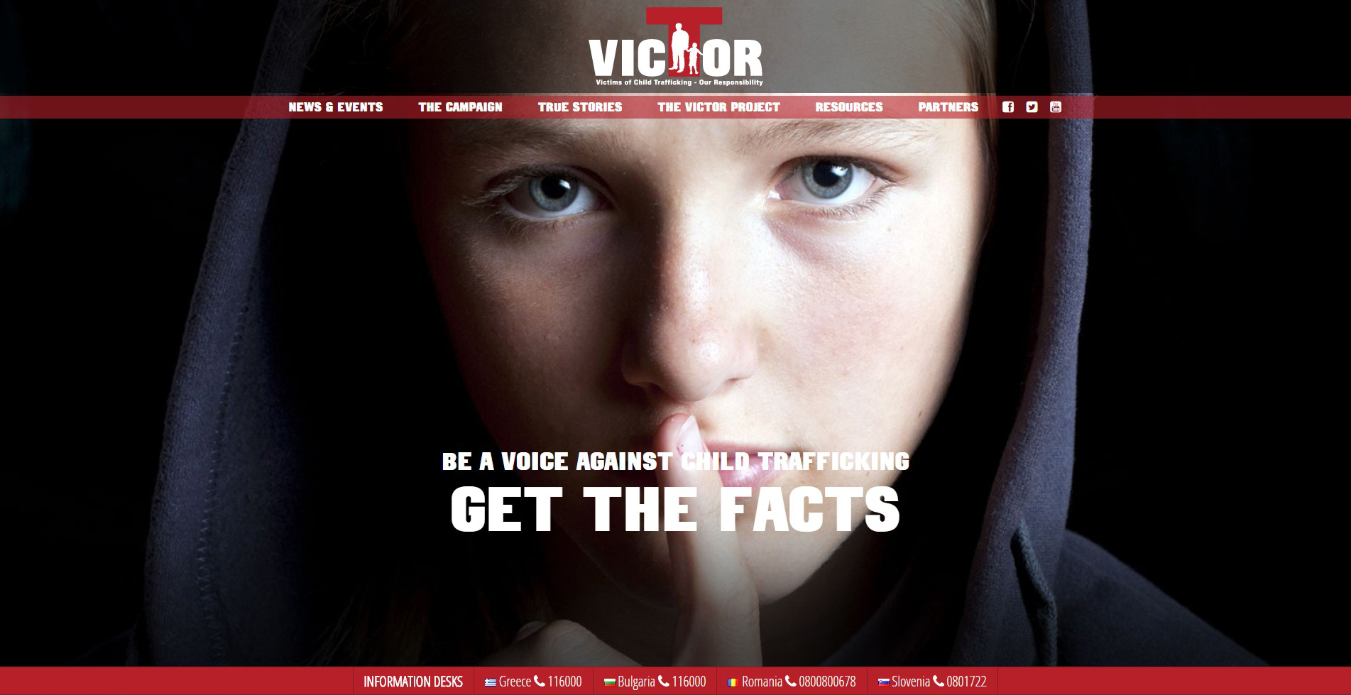
Flat design made a huge impact on graphics last year, so much so that Google released its own version of flat design called material design. Material design employs the same aesthetic as flat design, focusing on simplicity and clean presentation, but Google’s design has more subtlety. Whereas flat design includes simple illustrations to create recognizable but minimalist two-dimensional content, material design uses gradients, slight animation and shadowing to add depth to the image. With most web designers in a minimalist mindset, material design won’t be going anywhere soon. Below is Victor Project’s landing page, which is a great example of how material design works for logos.
11. Line icons
Alongside material design, line icons is the other movement finalizing the decline of skeuomorphism. Rather than an icon looking exactly like the object it represents (a design style that Apple popularized with its iOS icons), icons are created with simple lines and shapes that convey an action, object or thought we are all very familiar with. Many line icons have become universal in web design, such as the outline of a magnifying glass signaling the search function or the hamburger (three stacked lines) for a menu. Below is an example of line icons from Athenian Brewery.
12. Google Maps integration
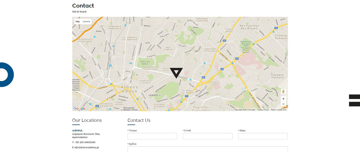
Google Maps is everyone’s go-to map service, and it is only getting better. With customizable options, more brands are integrating the service into their websites -- a move that is long overdue. Companies can add Maps to their site and customize its colors to complement their preferred color scheme. For example, Bar academy uses Google Maps and customized markers.
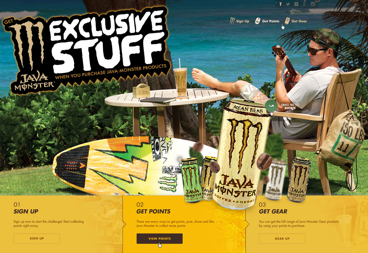
13. Scalable vector graphics (SVG)
When Apple released Retina display, designers were up in arms. Upset that their graphics and images suddenly looked pixelated with Retina’s higher resolution, designers were forced to adopt new methods that would allow their illustrations to look good on and be compatible with any device. Fortunately, Scalable Vector Graphics (SVG) rose to the challenge. SVG presents graphics as vectors, which allows them to scale with different resolutions. With SVG, images maintain their clarity and sharpness on all devices. Java Monster Gear, has many examples available, such as this one below.
Now that 2015 is coming to a close, which new trends will designers adopt in 2016?