Landing page mistakes that you make
Some of the top mistakes people make on their landing page and how you can avoid the same fate.
There’s a lot of discussion in the digital marketing space about various marketing channels and their effectiveness in producing conversions and sales. You’ve got SEO, retargeting, paid search, content marketing and display advertising. However, there’s one thing all these channels have in common that will play a huge role in the effectiveness of your marketing campaigns: The landing page.
Unfortunately, optimizing landing pages is often overlooked when setting up and executing marketing campaigns. Below we’ll go over some of the top mistakes people make on their landing page and how you can avoid the same fate.
Lacking Calls to Action

Your website really has one goal: Turn visitors into conversions. In order to do that, you need clear calls to action (CTAs) on your landing pages. Other landing page elements, like content marketing, attractive visuals and a good slogan are helpful in convincing people to become customers, but they need that CTA to draw their eye and get them to start the conversion process (whether that be ordering a product, completing a contact information form or signing up for an email newsletter). When adding a CTA to your landing page, make sure it is:
- Visible: This sounds obvious, but you might be surprised by the number of landing pages that bury the CTA below the fold. Users shouldn’t have to scroll in order to find what they’re looking for, so make sure the CTA is one of the first things they see when they click through to your site. If your CTA is already above the fold but still not getting a lot of clicks, it might not be optimally placed.
- Distinct: Calls to action should stand out from the rest of the page content, to better attract visitors’ attention. The most common way people do this is through the use of color. Choose a bright color that contrasts with the overall design of your page so it stands out, but not so much that it clashes. You don’t have to use just color — some pages get a little more obvious by adding arrows or other animated elements. Use this tactic with care; if you get it wrong you could make your page look spammy, which is not good for usability or SEO.
- Clear: CTAs need to be easy to read, but that’s not all we mean by ‘clarity.’ What’s really important is that there isn’t any ambiguity about what clicking the CTA will do for the user. Craft the text around what the end result of the action will be: signing up for a newsletter or free trial, adding a product to a shopping cart, sending contact information for follow-up communication, etc. Avoid generic language like “click here,” “buy now” or “submit” — users will scan it without registering it.
In the case of CTAs, more is definitely not better. Having multiple actions on your site will only overwhelm and confuse readers. Which offer is the right one? Should they be signing up for a newsletter or submitting their information for lead generation? They’ll end up leaving your site and doing neither. So if you’re lacking calls to action on your landing pages, don’t swing in the opposite direction by adding more than one for each page.
Cluttered or Ugly Design
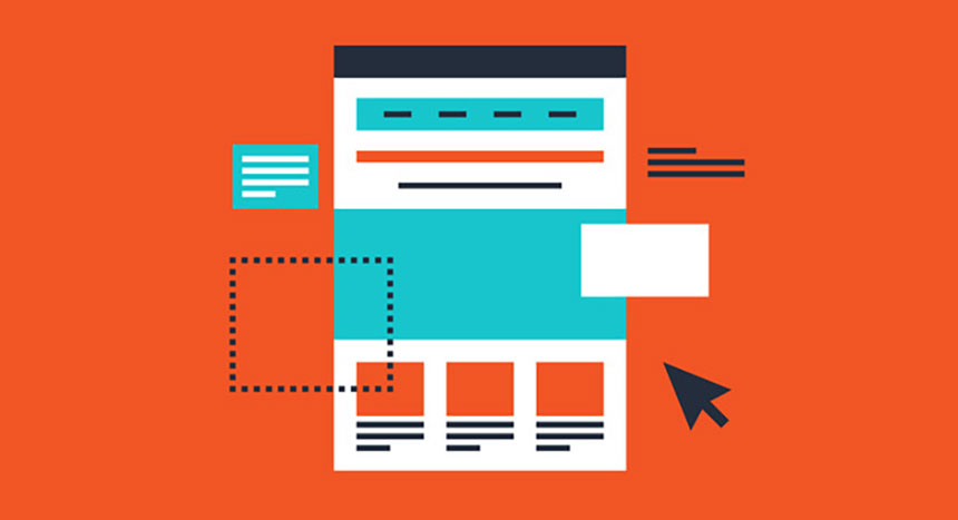
It’s no secret that design is incredibly important for landing pages: Visitors form their opinion of your site and business in the first half second of looking at your content. Put your best foot forward by using a clean, attractive design. 95% of those first opinions are formed based on the visual design of the page.
When designing a landing page for a particular marketing campaign, use one principle to guide all of your decisions: do not make people think. Get your messaging across in as few words as possible and use visual elements readily. Rely on these page elements to communicate with visitors effectively, without burdening them with the requirement of too much thought:
- Primary CTA: We just talked about this above: make your CTA clear, to the point and enticing. If you can, make the CTA the focus of the entire landing page — put it front and center and make it large and in charge so it’s obviously number one in your page’s hierarchy. If the call to action is more than just a button, consider options to visually set it apart; change the background color for a signup form or use paler colors for the rest of the page.
- Headline: Again, the guiding principles are clarity and brevity. Try to boil your value proposition down to just a few simple words. For example, a consulting firm might use “Business Solutions,” while an HVAC company could use “Keep Cool” (or warm, depending on the season). If you’ve got a special offer, create a sense of urgency by adding the expiration date, or maybe even a countdown timer, as a sub-head.
- Product/Service Information: At the risk of repeating ourselves, make any product or service information you have on your landing page as short as possible, and don’t make people think about what you’re telling them. Focus on how your product will help customers achieve their goal and then tell them in a few sentences. Remember, this isn’t your homepage so you can get a little bit wordier here. Break up sections of text using illustrations or other images so you don’t burden your readers.
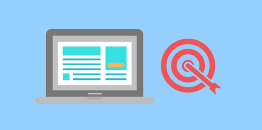
- Visuals: Images are some of your best friends when building landing pages dedicated to marketing campaigns. Use them incorrectly, though, and they can depress the conversion rate of your campaign. One of the best things you can do for your page is to avoid stock images — using custom images can increase conversion rate by 35%. They can help show what sort of industry or niche your product is in, but not how it works to add value to their lives. Instead, use custom photos to show your product in action or illustrations to show off a bit of your company culture or values.
Inaccurate Messaging
Matching your landing page to expectations set in your ads or search snippet (the title, URL, link and description of your page displayed in search results) is vital to maintaining your audience’s trust in your business. Losing their trust will hold back your marketing efforts in multiple ways:
- High Bounce Rate: Promising a product or offer without delivering immediately when the visitor arrives on the page will cause them to exit the page without engaging with your site. This is bad for your SEO since it tells search engines that your site is either irrelevant to the keyword or provides a bad user experience.
- Low Quality Score: Quality Score is Google’s secret recipe to determine an ad’s relevance to a keyword. Landing pages that don’t back up what’s in the ad severely lower your Quality Score. This will require you to bid much, much higher to get your ads to appear in search results, if at all.
- Retargeting: Retargeting is a great way to recapture people who don’t convert the first time around. However, if your site doesn’t jive with the ads that bring people to the landing pages, they won’t trust your retargeting messaging and will be much less likely to come back and finish converting. Even worse, if you follow people around the web with an offer you don’t have on your pages, you’ll look like a scam and risk damaging your brand.
If you advertise any discounts or other deals, reinforce them prominently at the top of the landing page where visitors can’t miss it. Don’t advertise any features your products don’t have (or don’t do well enough to retain customers). If you do talk about specific product features or services, explain them quickly in your landing page content (remember to do it in a way that your users won’t have to think too hard about).
Inefficient or Complicated Conversion Process
It’s normal for any business to have abandoned shopping carts no matter what — just view them as leads to convert using retargeting later (this marketing tactic has great conversion rates for abandoned shopping carts). However, you could unknowingly be contributing to your leaky sales funnel by making the process long, complicated or burdensome. Optimize the sales process to limit the opportunities people have to drop out:
- Don’t ask for too much information, and try to only ask for what you need to provide your service. Think of it this way: if you were a brick-and-mortar shop, would you be asking people who came into your store for this information? You probably don’t need to ask for a physical address (outside of your billing system) to deliver digital goods or set up a free trial for a web app.
- Eliminate unnecessary steps. People want things to be quick and easy so every step you put into the conversion process is going to make them like you a little bit less. Consolidate as much as you can on the landing page itself — people can create accounts, enter contact information, download a file and sign up for newsletters right on the landing page. If you can’t download an app right on the landing page, include a prominent link to Apple’s App Store and Google Play where they can find the app.
Remember, every new page you send a user to is an opportunity for them to leave your site. Limit those opportunities by making conversions easy, simple and as fast as you can.
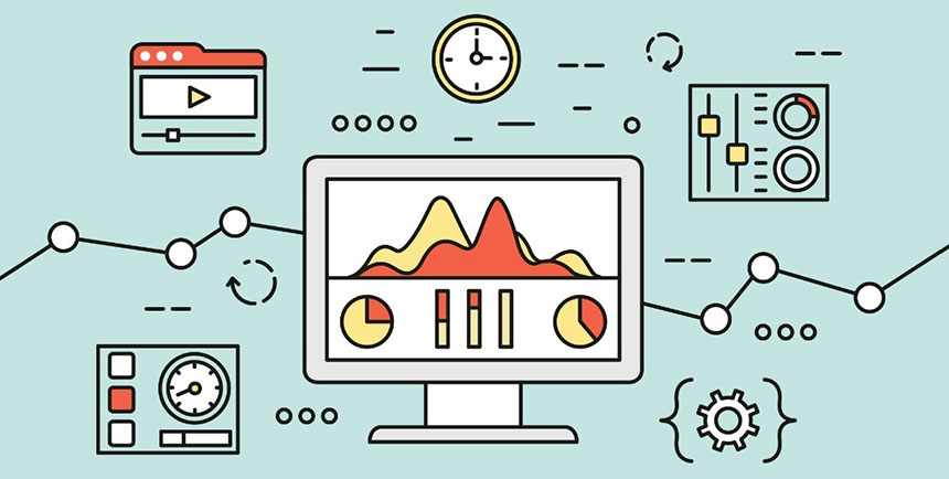
Failure to Track & Optimize

No marketing campaign is complete without tracking your process, measuring your success and making adjustments. Optimizing landing pages for conversions are no exception. People pay a lot of attention to optimizing their ads for click through rate and conversions, but the landing page can often be overlooked. Do these things for your landing pages to make sure you’re making the most of every opportunity to convert your audience:
- Keep track of traffic coming to the page. Use Google Analytics to track events on your page and set up conversion goals and funnels so you can monitor your sales process. Although you can get a good sense of the overall health of your campaign, without this step you won’t know if success or failure is due to ads, landing pages or something else entirely.
- Optimize your pages. Based on insights gained from your analytics, tweak elements of your landing pages to find what works best, or, if it’s really underperforming, give it an overhaul to improve user experience. Even if you’re happy with your current sales or conversion rate, they could still be better. Or, you could be learning what’s working so you can use that in future campaigns.
- Test your changes. The results of content or technical changes to your website won’t be very helpful if you don’t have a set of control data to compare them with. For best effect, run the two pages at the same time as an A/B test to eliminate time of day, day of week or other outside variables that could impact performance. Of course Google has tools to help you with this, and you can use the rel=”canonical” tag to help offset any issues you have with duplicate content.
In Conclusion
Digital marketing can look like a complicated, intimidating space if you aren’t living in it, or don’t have the time or resources to find someone who does. Fortunately, you can really set yourself up for success by creating effective landing pages for your marketing campaigns. Avoid the common mistakes above and you’ll get yourself into the right position to execute an effective marketing effort regardless of channel, industry or product.
Thanks to SitePoint