Browser testing is no fun, but these tools will help make your life easier
Many people who feel their jobs end after designing and launching a site are potentially missing out on tons of visitors. Why? Here’s a guide to why browser testing may not be the most fun part of developing a site, but it’s just as important as picking t
Designing your website is very exciting and gives you the opportunity to unleash your creative side. Choosing colors and themes, finding or commissioning images for the pages, and writing about yourself or your company is incredibly thrilling when you see it complete for the first time and you are ready to launch it to the world.
One area of designing a website that is often overlooked is browser testing. Many people who feel their jobs end after designing and launching a site are potentially missing out on tons of visitors. Why? Here’s a guide to why browser testing may not be the most fun part of developing a site, but it’s just as important as picking the right domain name and coming up with a good user experience.
What Is Browser Testing?
In its simplest terms, browser testing means checking how all your web pages look when viewed in different browsers like Explorer, Firefox, or Chrome. You might not be aware that different browsers can give your site a different appearance, but it’s true and only by testing your site can you really see your pages as others do.
If you already have a site that is up and running and you don't currently browser test, it’s imperative you start now. If youare in this situation, one of the most crucial questions to ask and find the answer to is how your users are accessing your site: what are the most commonly used browsers? Start from here to give you a snapshot of your visitor experience.
Why Is Browser Testing Important?
Those using the internet now have a wide number of options as to their browser of choice. Deciding not to carry out any browser testing – as well as future testing when pages are added or designs change – mean that many potential visitors could find your site inaccessible or difficult to view. Throw in those who use their smartphones to browse and any site that hasn't been compatibility checked for mobile device users can mean lost revenue from day one.
A recent development that adds to the weight of why browser testing is now even more important is that Google has now announced that it will be looking at the speeds of sites when it comes to calculating its ranking position algorithms. What this means is if you have a slow site, then Google will count this against you when it comes to choosing who is at the top of the search results – a timely opportunity then to start thinking about browser testing if you haven’t already considered it.
What Can Cause Your Site To Look Different?
There are a number of issues and influences that can mean that a user will view your site on their screen in a different way than how you intended. There are so many variables – including some you don't have control over – that mean every visitor will probably see your site in a slightly different way. These are the main elements that mean you could have site display issues:
User hardware
: The graphics card installed in the machine, the color settings, and the display resolution setting the visitor is using can mean a different experience for each personSoftware
: The operating system being used and installed fontsOlder versions of browsers
: Some visitors may not have updated their browsers for a very long time and this can mean they can't access your site fully
Browser Testing And Mobile-Optimized Sites
With the number of smartphone users now using the internet for all the same reasons they would access it on a laptop or tablet, having a fast and accessible site is essential. Visitors to your site are often on the move rather than sitting at home and so want, no, need, instant access. They don't want to wait for images to download or find themselves experiencing dead links or videos that won’t play.
Google algorithms are a closely guarded secret when it comes to how it decides who secures the much coveted top spot of any search engine result. It has announced though that from 21 April 2015, it is increasing its use of mobile-friendliness as part of its ranking decisions. This means that from this date, mobile device set up will count toward whether Google sees the site as high quality and relevant to the search being made.
The Testing Set Up
If you're not a web development expert, don't worry. You don't need to build your own testing set up – you just need to know that testing is an important part of building your site before it’s launched and after as a part of maintenance.
For those who have some technical background in other areas of IT and want to branch out into browser testing, a framework browser testing set up would include:
Testing browsers
: Mac and Windows variantsTesting devices
: Different iPhones, Android models, and MacbooksSynchronized testing system
: Carrying out tests at the same time across different browsersRemote debugging software
: The ability to debug mobile sites where a right click isn’t possibleEdge case browsers
: Exploring and resolving unexpected user input, interrupted sessions, or incredibly old browsers being usedScreenshot testing
: Automated testing to give an instant viewing snapshotViewport resizing tool
: The size of the screen the visitor is using – it will vary according to device
Some Great Tools To Help Test Your Site
With browser testing being such an integral part of any website’s development, there is an ever-changing range of tools available to help everyone test their sites; whether beginner or professional. It’s impossible to test your site on all the available browsers so this is where technology steps in to assist. Website designers and developers have the responsibility of ensuring every visitor can view all aspects of the site and that all the features work in the way they should.
The best testing tools are designed to make the job easy to carry out and the results straight forward to digest and action as necessary.
Here’s a rundown of some great browser testing tools – whatever your level of knowledge and experience.
Browserling
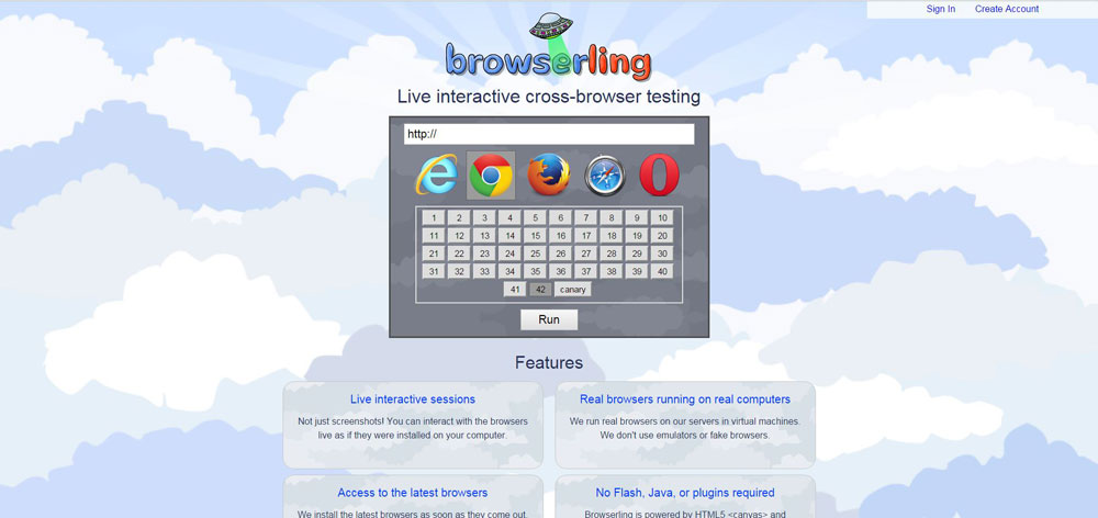
A completely interactive user tool, Browserling is incredibly straightforward to use. There’s no need for add ons or plugins. Simply type in the web address and choose the browser it will be used with and the version. That’s all there is to it and the instant result will show you just how your site looks to a visitor of the combination you've opted for. There’s just short of 100 different combinations you can select, plus it’s live and anonymous so you don't have to be concerned about any security issues.
Browserling is a great tool for anyone starting out with their first website and wanting a really easy way to check their site quickly. There are just a couple of selections and the result is displayed.
Ghostlab
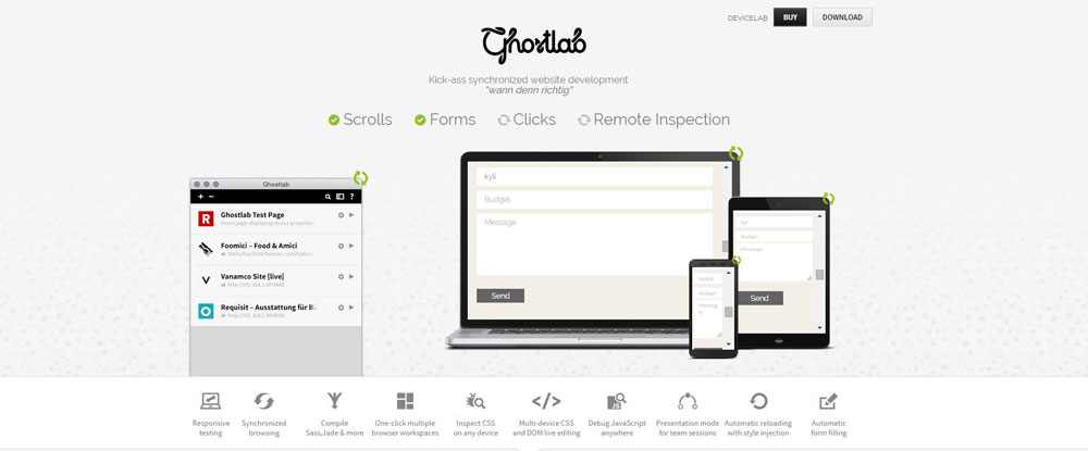
As well as how the site appears to visitors on different browsers, you also need to be aware of how the different functions work; page reloads, scrolling, and clicks for example. This is where Ghostlab steps in.
Ghostlab is able to offer a whole user experience so you can see exactly how your site looks and performs – an eye opener if you've not used browser testing in the past or it’s been a while since you tested your site. The package is a fast and seamless choice and has a server app included. This means you can synchronize your pages to your local directory and you won’t encounter any problems. There’s also a workspace feature that’s incredibly easy to use as there’s no custom set up needed.
This is a great browser testing app for someone who doesn't have the technical knowledge to carry out specific set ups before getting started. It’s an absolute “plug in and go” operation. For those wanting to customize their set up, Ghostlab is an excellent choice for both synchronized testing and remote debugging.
BrowserStack
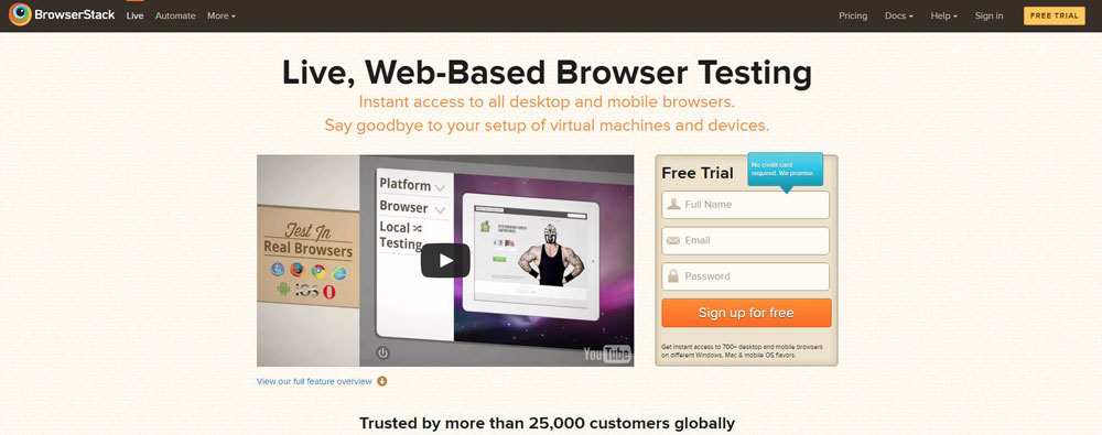
BrowserStack is an incredible tool in that it has the capability to support over 300 different browsers and mobile devices (yes, there really are that many different ones your visitors could be using!) and you can use it online so you don't need to install on a number of different devices to be able to work from anywhere.
The reason BrowserStack is so popular is because you can see exactly how your site looks live, at any time. It’s also excellent for bug fixing and you can use it to test devices you don't have access to as the offering is so wide. For those with edge case browser issues, this is the tool for you.
Saucelabs
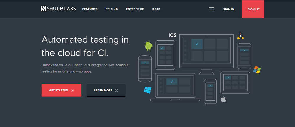
It’s all very well running a multitude of tests to find out what’s happening with your site but while this is happening, if you spot a problem it can be frustrating that you can't do anything about it until the test run is complete.
Not so with Saucelabs. As the tests run, if a problem is flagged up or you spot something you want to investigate further, you can jump in and start work, fix the issue, and then continue testing.
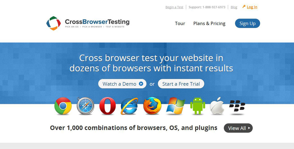
CrossBrowserTesting
Browser testing isn't just about looking at how the site fares when viewed on different platforms; it’s also about exploring how apps and plugins are working and checking site speeds.
CrossBrowserTesting is a really useful multifunctional cross-browser testing tool. It offers an incredible 1000+ combinations you can test against each other. With different browsers working alongside different operating systems and apps, this is for someone who loves to think about all the different angles they could test their site to.
For site owners who want a one-stop shop where they can rely on one tool to carry out many jobs, CrossBrowserTesting is perfect. This is because when they start, CrossBrowserTesting offers:
- Automatic screenshots
- Live testing
- Login testing
- Testing of mobile platforms
- Support for video embedding testing
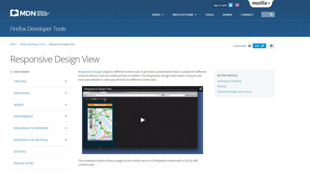
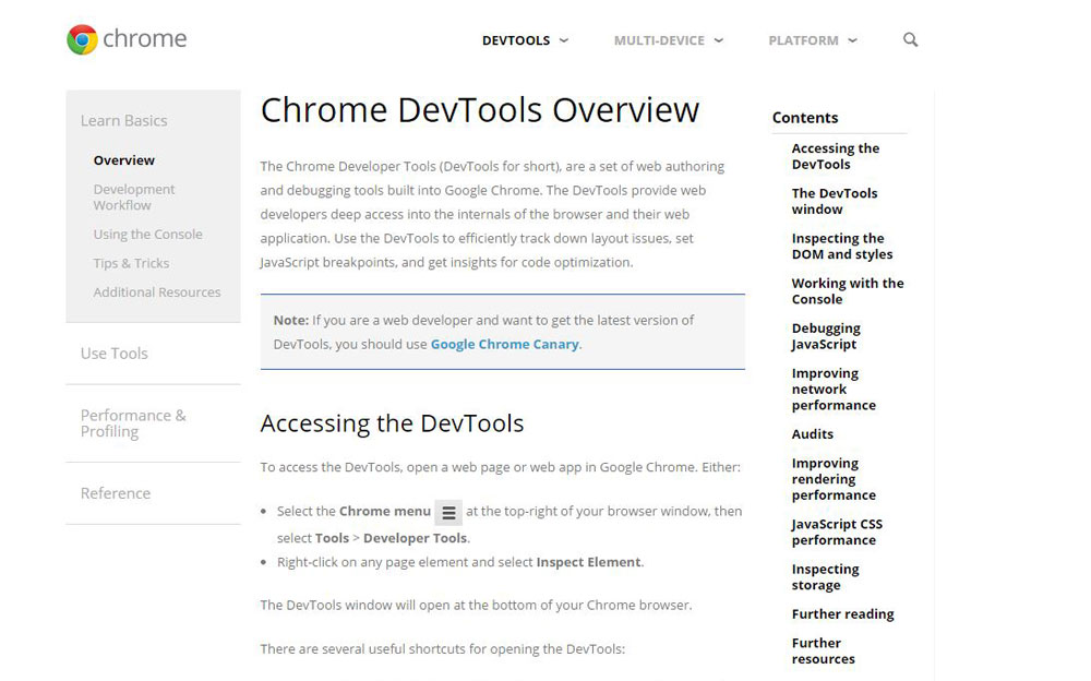
Browser Tools – Firefox and Chrome
Browsers themselves all come with a really comprehensive developer tool kit. A couple in particular now have particularly nice features:
- Firefox: The Responsive Design Mode gives you the opportunity to alter the content area of the screen without needing to change the window size. This means you can viewport with ease. It can be found in the Tools section of the menu in the Web Developer area.
- Chrome: Many website owners already use Google Chrome DevTools for other areas of their site management. A neat addition recently is the “override” setting where Chrome will emulate a mobile device. It’s in the Settings section of the toolbox and is a really handy way to check how a website works when the device detection delivers a mobile site.
Screenfly
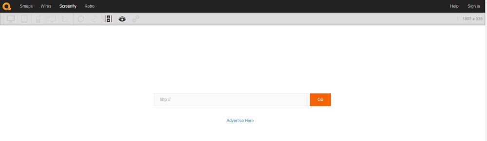
With different visitors choosing from the range of screen resolution options available on their device, you need to know how it will look.
Currently the most popular screen resolution is 1366x768, but many change it to suit their personal preferences or if they need the resolution increased to help with poor eyesight. This is a shift change from the previous almost standard resolution of 1024x768 used with desktops. Enlarging or decreasing the screen resolution could mean your site looks squashed if too small or becomes very pixelated if greatly increased.
Screenfly will display your site in a range of screen resolutions so you can see the pages through the eyes of different visitors. With the internet available on such a range of devices, for instance desktop, laptop, tablet, mobile, or even through the TV, this is an important element to check out and Screenfly does the job well for you.
Testing, Testing…
Don't worry if you're just starting out on your website journey for a newly created business. To be honest you're in a great position as you can use any one of the online, real time, one-site perform-all tools pretty much without any knowledge and you'll get instant results.
As long as you realize why it’s important and act on this before you launch your site and then continue to be diligent every time you add pages or make any design changes, you’ll find that these tools do all the work for you.
While browser testing isn't the most visually pleasing or stimulating aspect of creating a new website when all you want to do is unleash it to the world and bring visitors to you as soon as possible, it’s one of the cornerstones of a successful site where visitors become customers thanks to ease of use and a professional look.
Building trust and reputation is crucial and a browser tested site means the difference between people turning to or away from your company and being loyal or looking to your competition. It’s imperative then if you haven't considered browser testing as important so far, to start today. You'll soon reap the rewards.
Thanks to elegantthemes