Creating the perfect UI dashboard
The importance of user experience is more emphasized than ever. As a result, the number and variety of dashboard UI tools is on the rise. These tools are used as an essential piece in any good customer experience strategy. But, here comes the hard part.
How can you create a dashboard user interface that provides users with a simple and swift access to the information they need on a website?
Before we move onto creating the perfect UI dashboard, let’s first answer one highly important question:
What is a Dashboard UI?
Dashboards are a powerful opportunity to influence user behavior and boost retention rates. By using the data collected through research, designers can create a dashboard that displays actionable and relevant data. All this is made possible through dashboard UI design.
If you design a proper and modern UI dashboard, it will give the users easy access to the information they need. For this to happen, the dashboard information needs to be easy-to-scan and contain only the key information. But, with many tools available, it can be hard to make the right choice or not exaggerate with the use of features.
This is one of the many roles of a UX designer and as such, it demands knowing certain tricks to be handled the right way.
How to Create an Excellent UI for a Dashboard
Understand the Needs of the User
The data a designer collects through various user research methods can seriously impact the quality of the design and the user experience.
To create a dashboard UI, you need to perform such research, too. When you research the target audience, you will learn what they want and need. Based on that information, you can determine what is the most important data to use in the dashboard.
Decide on an End Goal
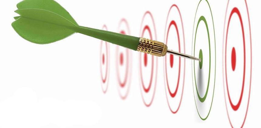
No matter how creative you are, you can't simply go with the flow and see where your gut takes you. If you want to succeed in your dashboard design, you need to have many end goals in place. Among those end goals, one is making the decision of what your dashboard will present.
Pick a Dashboard Type
According to DataPine, there are four main types of dashboards to choose from:
- Operational: Dashboards used for business intelligence purposes. Their goal is to measure, monitor, and manage operations with a more immediate or shorter time scale.
- Strategic: Unlike the operational dashboards, strategic dashboards are used for long-term strategies of a business. They work by analyzing the most essential information based on trends.
- Tactical: Dashboards full with an array of data. This data is being used mostly to help formulate the strategies for growth in mid-management circles.
- Analytical: Dashboards with large bits of comprehensive data. Such data is used by analysts to help them create insights that help the business grow at an executive level.
If you aren’t certain which type is for you, the best way to find out is by example. Seek dashboard UI inspiration in your competition.
Use the Five-Second Rule
Dashboards give users access to relevant information. Their main purpose is to resolve the frequently asked questions within a short timeframe. With that in mind, use the five-second rule.
How can you do this?
Well, keep in mind that a user will be willing to spend five seconds to find the information they need.
Does your dashboard provide this?
If it doesn’t, this might be the reason for the low app retention rate problems you’re facing.
Put Emphasis on Information Architecture
Everything from data hierarchy to layout is important for the success of your dashboard. But still, your design needs a balance to function. To achieve a balance, aim for a design that emphasizes the most important elements over the less important ones.
Choose Your KPIs Carefully
A successful dashboard design is a KPI dashboard design.
What does this mean?
KPIs are metrics used to display a visual representation of the most relevant data based on different areas of your business or brand. Once again, you can use your audience research to select the best KPIs to use in the dashboard.
Provide Context
How are users supposed to get your message if you don’t provide context and comparison values? The numbers on a given dashboard carry no meaning without context. Also, the users won’t know if you require any action on their behalf.
When designing a dashboard, provide maximum information in the provided space. Even if the data seems obvious to you, it can still appear strange to the user. Therefore, provide comparison values and add titles to all of the charts you use.
Don’t Forget about Aesthetics
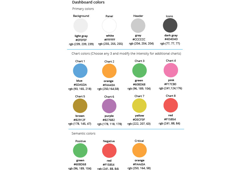
We live in a society that’s highly focused on aesthetics. That’s why every designer needs to treat his dashboard as a publisher would design his book.
Why, you might ask?
As the saying goes, books are judged by their cover. So is a dashboard. It is judged by its appearance. Therefore, when you finish with the data and hierarchy of it, it’s time to move onto the dashboard’s aesthetics. Pick the right colour combination, format, font, and layout.
Final Thoughts
Regardless of your experience in the field, good practices like the ones above will surely make your dashboard UI stand out. When you put your time and creativity into it, you can influence a huge portion of the target audience. Creating a useful and helpful dashboard is only one step in that direction, but a really important one.
Thanks to adamfard