Google's 2014 redesign: Before and After
I thought it would be worth a quick stroll down memory lane and a look at the future of Google
Over the past few months, Google has been testing a redesign of both their overall SERP format and their AdWords blocks. In the past day or two, it appears that they've rolled these changes out to a large part of their audience. While we still have a chance to grab before and after versions of the SERPs, I thought it would be worth a quick stroll down memory lane and a look at the future of Google.
I. Basic search result
Let's start with a pretty basic search result, a query for . Here's the before and after:

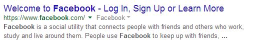
The title font in the new version is slightly bigger, and Google has done away with the underlining. Interestingly, the source URL is actually a little smaller. The snippet and mini-links seem to have remained the same.
II. Expanded site-links
Here's a #1 result with expanded site-links.
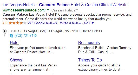
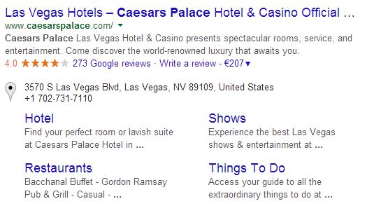
Like the main result, site-links are also getting the larger title font without underlines. This example also clearly shows that some title tags will get cut off with the new, larger font. This could impact click-through rates, so you may want to consider shorter titles going forward (at least for critical pages).
Notice the faint horizontal divider at the bottom. This sets the expanded #1 result apart from the rest of the SERP. These horizontal dividers are used frequently in the new design, and I strongly believe that they are a move toward a more card-like look (akin to mobile, Google+, and Google Now).
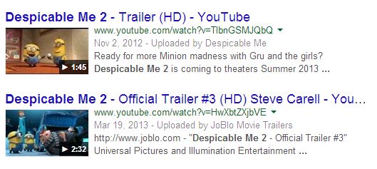
III. Image vertical results
This is what the new image vertical results look like.
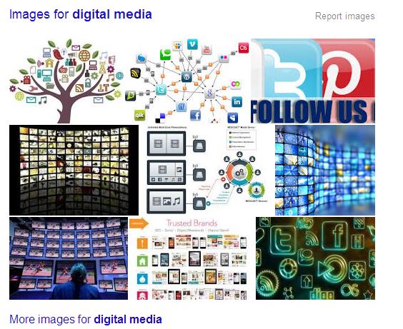
The new format has the new font, plus a fairly pronounced "More images…" link. Again, the vertical results are separated (above and below) by a horizontal divider. The images themselves appear to be formatted the same.
IV. News vertical results
Here's a query for , showing the redesigned news vertical results. Note that these were captured on different days, so the actual articles have changed—the count/layout are equivalent, though:
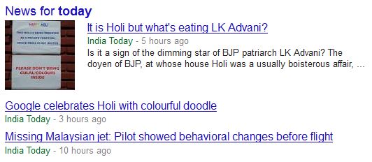
All articles links are using the larger font (with the same implications for length/wrapping). Like image vertical results, news results get a top and bottom divider. In general, you can see that almost every type of result is taking up significantly more vertical space.
V. Local pack results
Here's a 3-pack of local results, for the query and focused on Munich, Germany:
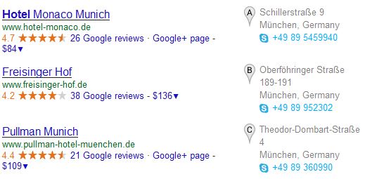
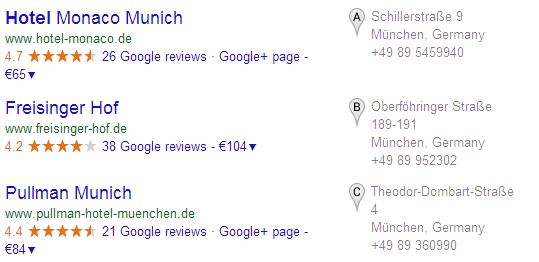
Larger font, no underlines, horizontal dividers—you know the drill. Note the lighter-gray text on the actual location information (address and phone).
VI. In-depth articles
Here's a look at Google's newest vertical, in-depth articles.
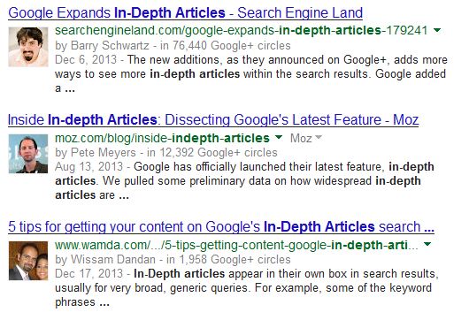
The redesign pretty much follows the pattern of the other verticals. Note that the actual header font—"In-depth articles"—is a bit smaller and slightly grayed out.
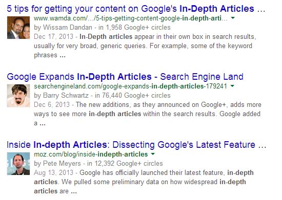
Google has been testing many variations of in-depth articles, and all of them suggest that this expanded format may be replaced with something more Spartan.
VII. Video thumbnails
In 2014, video results are really more of an enhancement than an actual vertical.
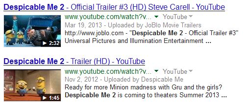
This is essentially just an organic result, with a bit of information and a thumbnail added—the general layout and thumbnail characteristics have remained the same. This also true of authorship results and review snippets—the title and URL fonts have changed, but the general layout, thumbnail size, etc. seem to all be the same.
VIII. AdWords (top)
On top of the general design change, Google has been testing a new AdWords format for months—these may be rolling out together, but the tests themselves have been separate.
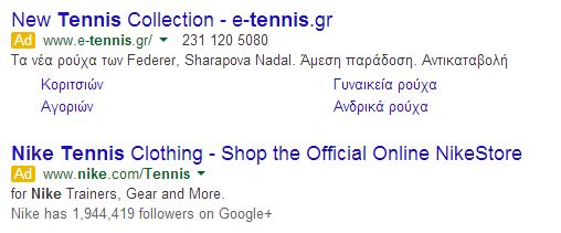
In addition to the larger, non-underlined titles and horizontal divider, the colored background is gone, and a yellow [Ad] box appears next to each individual ad.
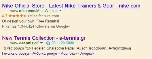
IX. AdWords (right)
The AdWords block in the right-hand column has also changed, but the difference is a bit less dramatic.
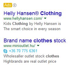
There's just one yellow [Ads] label for the entire block, and there's no change to the background (because the old version didn't have a colored background). The new fonts do expand the titles significantly and increase the vertical area of the total ad space.
Note that the AdWords block on the bottom of the left-hand column looks very similar to the redesigned top AdWords block. Other SERP elements, including the knowledge panel, answer boxes, paid shopping, and carousels seem to have been unaffected by the redesign (so far).
It's in the cards
As mobile and tablet proliferate, and new devices like Glass come into play, Google wants to have SERPs that they can easily mix-and-match, providing whatever combination is most relevant for each device and situation. For now, desktop remains a fixed, two-column format, but Google's design decisions are being driven more and more by mobile devices, and the future is in individual information elements that can be easily rearranged.
While a horizontal line might not seem like a big change, Google is clearly working to carve up the SERP into units that can potentially be mixed and matched. Also note where "#2" is on this page. As simple as they may seem, these design changes are redefining organic results.
Do you like it?
Trick question—no one cares. Sorry, that was a bit harsh, but here's the reality: Google has been testing this for months across what are probably millions of unique visitors. A few dozen marketers complaining about the new design is not going to sway their decision. At this point, the decision is 98% made, and it's made based on Google's goals and Google's data. The best you can do is try to assess how these changes impact your bottom line and adjust accordingly. Don't waste your time shouting at the wind.
One final note: While this redesign seems to be rolling out, Google has not officially confirmed the change and it may still be in testing (albeit widespread testing).
Thanks to moz.