5 logo design trends for 2018
We forecast the five biggest trends that will shape logo design in 2018.
A great logo, now more than ever, must cut through an awful lot of noise. The art lies in working out exactly how you do that. As with branding trends and typography trends, knowing which logo trends are proving popular with audiences right now is a useful tool – whether you want to capitalize on a trend, give one your own take or do something completely different.
Here we're taking a look back at the trends that shaped logo design in 2017 to forecast the biggest trends of 2018. There's a lot of overlap in the logo design trends we've picked out here. Some logos – the best of them – used two or three trends.
In 2017, a year of lots of noise and confusion, the very best logo designs offered a quiet, understated authority, something both familiar and new. "Evolution, not a revolution," is how one designer said it. That's not to say there was no room for the bold or the creative. The best logos of 2017 also took chances and dared to be different.
01. Simplicity and clarity
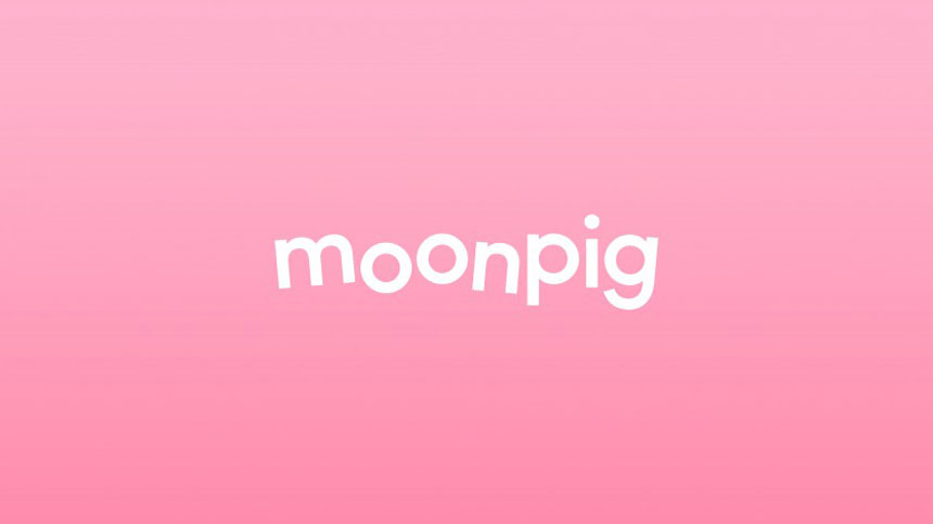
Moonpig's new look is far more minimal
Simplicity has been king for a while. In 2016, we saw it in Pentagram's redesign of the Mastercard logo, in which the agency focused on "simplicity and clarity."
At the beginning of 2017, we saw it in Interbrand's bold redesign of the Juventus badge, "fearlessly embracing its potential as an identity brand." And we saw it towards the end of 2017, with Moonpig, led by the brand's in-house creative director James Turner. Greetings card company Moonpig dropped the .com from its name, and the cartoon pig that went with it, in favour of something a bit subtler.
You could argue simplicity's offshoots include minimalism, black and white logos, and those with framed texts, which we've also seen a lot of. In noisy, confusing times, the trend towards making things neater and simpler looks set to continue.
02. Uppercasification
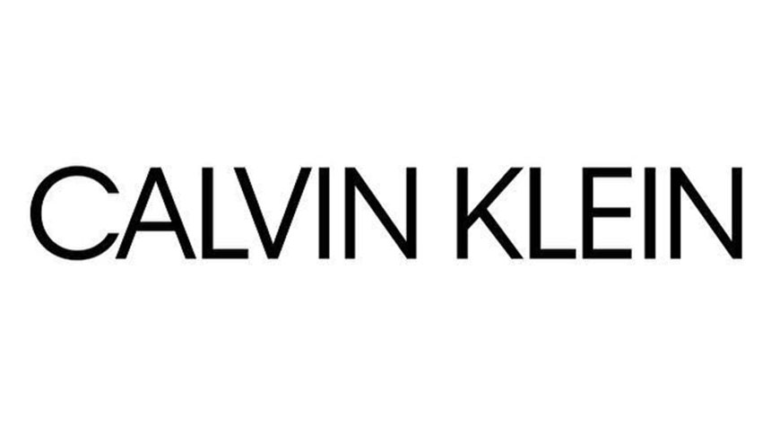
The new Calvin Klein logo uses sleek all-caps typography
This trend is perhaps based on principles opposite to simplicity. In noisy, confusing times, you could argue that it's necessary to be noisier than everybody else. At least, that's how logos created in all uppercase can appear.
But done well – usually when paired with a simple design and a smart typeface – it gives a logo a certain authority. Done really well there's a quiet, understated authority to uppercase logos, with the typography feeling natural rather than forced and shouty.
As a trend it's a bit of broad stroke, but an unavoidable one nonetheless, seen in redesigned logos in 2017 by brands such as Calvin Klein, Giraffe, Ebury and too many others to mention.
03. Modern retro
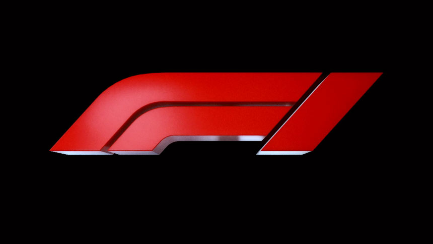
The new F1 logo feels like a modern spin on a 1980's look
Formula 1 recently unveiled its first new logo in 23 years. The design, led by Wieden + Kennedy London, aimed for a "modern-retro feel." It's dynamic, and a bit masculine, like the sport, but it also has a real 80s feel.
You can see the idea of modern-retro logo design in new logos for brands such as SYFY, Fanta, and Nintendo. Again, you could argue that this trend is a sign of the times. With so much change going on around the world, brands want to tether themselves to the familiar, even when making a change of their own.
04. Evolution of established logos
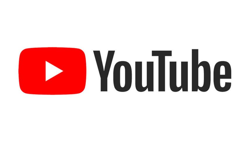
The new YouTube logo wasn't vastly different to the old one
"It’s an evolution, not a revolution," said Christopher Bettig, head of YouTube’s art department, after the brand changed its logo in 2017. The new YouTube logo incorporated the already iconic play button and moved the emphasis off the "Tube." Aside from that, subtlety is key here.
Evolution not revolution was seen elsewhere in 2017 logo rethinks by similar brands. Pinterest's new look is a good example. But Dropbox had it both ways, with the evolution of its logo and a controversial revolution of everything else.
05. Flat design
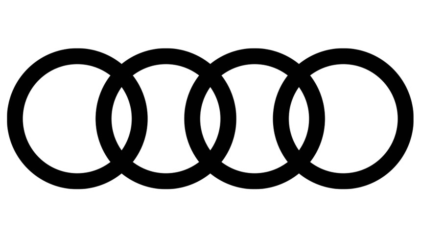
Audi's rings were flattened in its new logo
Check out the designs for Mush, Monzo, and Uniplaces, for example.
Perhaps the best use of flatness in 2017 came in the redesign of Audi's logo. The car manufacturer has always been switched on when it comes to branding and advertising, and this update is no exception. Not only is it flat, but it's simple, modern-retro, and an evolution, not a revolution. Vorsprung durch technik indeed!
Thanks to Creative Bloq