Making the user trust your UI
You cannot design a good user interface without taking into consideration the importance of user confidence
You cannot design a good user interface without taking into consideration the importance of user confidence. Unfortunately, it is not as easy as you might expect to design user confidence.
Basically, you have to go beyond placing all the right buttons and ensuring the adequate connections (even though that can be useful as well). If you want for the user to stay on your website/app, without getting too irritated, you have to pay attention to the user confidence.
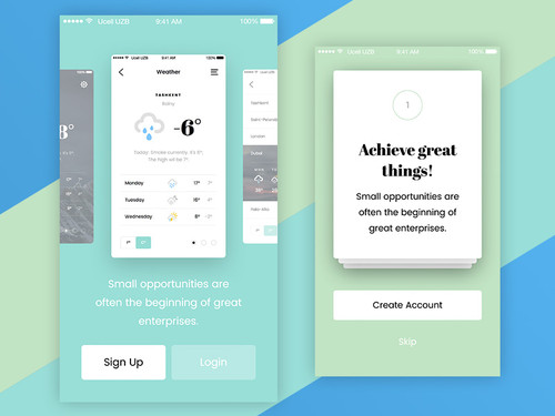 Image source: Fair Mobile UI Kit
It is clear that you do not want your users to use your interface with too much ease, bragging on Twitter in regard to their achievements. At the same time, you do not want them to rate their knowledge of your user interface on their CVs (the only exception to that rule would be if you were designing in Photoshop).
The idea is to give a good feeling when it comes to the actual navigation. You need to make sure that they have understood the purpose of the website or app.
It is important to understand that users start out with certain expectations in regard to the design quality. If one has already assumed that you are presenting a flawless design and you are failing to meet these expectations, you cannot expect to succeed (even though you might have been able to market and sell your product).
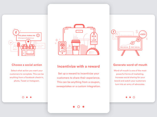 Image source: Kyle Anthony Miller
If the functionality of your app/websiteis affected by the design choices you have made, you need to make the necessary amends. No matter how well intended your decisions might have been, you need to remember that time is a precious resource of the user.
If there are too many clicks to be made, you might be adding a permanent blot to your brand image, suffering on the long run.
CLARITY FOR THE USER INTERFACE
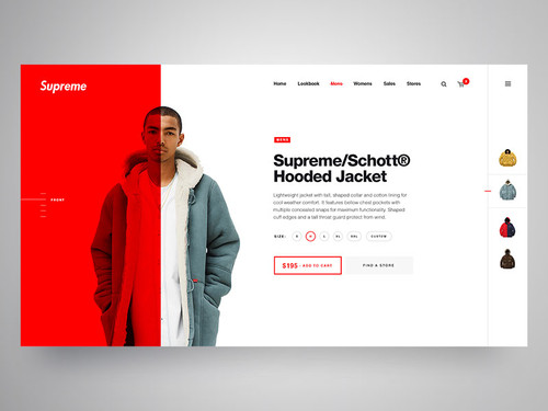 Image source: Matt Thompson
Clarity should represent one of the essential features of the user interface. The level of effectiveness is clearly linked to the concept of clarity; the user has to be able to identify the purpose of your website or app, the reasons why he/she should be interested in using the respective resource, the level of interaction guaranteed by the interface, understand the result of using that particular interface and then actually use it with success.
Yes, it is possible that an interface has an air of mysteriousness and might even offer a tardy satisfaction but confusion is not a pleasant thing to come across.
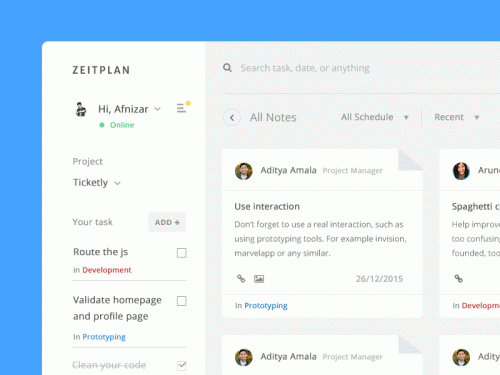 Image source: Afnizar Nur Ghifari
On the other hand, clarity is a feature that generates confidence and long-term usage of a particular resource. It is a known fact that it is for the best to have multiple clear screens, rather one single one, that is cluttered.
The majority of the designers have the tendency to create a user interface with a high degree of complexity. This is because they want their user interface to stand out from the crowd, being described as cool and unique at the same time.
In the opinion of these designers, the user should be more than pleasantly impressed with the overall design, not to mention with the power and usability offered.
 Image source: Veronika Bass
The user, on the other hand, is solely interested in using the website or app; most of the times, he/she is looking for functionality and does not necessarily want to be impressed. The more complex the interface will be, the higher the risk for confusion.
The user should not be affected by the mind-blowing user interface, but rather this should remain in the background, as you will have the opportunity to read below.
USERS NEED TO BE IN CONTROL
 Image source: Davide Pacilio
It is human nature to control one’s own person and also the environment in which he/she lives. When the software choices are not adequate, one loses control quite easily; moreover, there is a lot of confusion and discomfort associated with the various interactions.
The user should always be in control of the interface. In fact, the user needs to be able to decide on where he/she can go, future activities and actual usage of the interface.
 Image source: Eric Atwell
In order to ensure a design that will allow for such kind of control, there are two opportunities available. First, you need ensure that the user knows how to use your interface, by directing him/her on the right pathways.
There should be no confusion when it comes to such matters. Second, you have to offer the necessary feedback to your users. It is as if they were driving on the open road, requiring information that they are heading in the right direction. Once you provide this kind of feedback, the user experience is going to be improved.
IMPORTANCE OF CLEAR NAVIGATION
 Image source: Dwinawan Hariwijaya
In the majority of the web pages, the user has to navigate different hypertext links in order to reach the desired page. A big problem that a lot of interfaces present is the confusing navigation process throughout the website.
There are a wide range of elements that can be used in order to improve the quality of the navigation process, giving users the confidence that they are looking for. Among those elements, there are: summary screen, graphic/written overview, title and heading for every page, scheme of graphic identity and icons that are both clear and consistent.
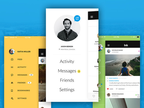 Image source: Ink iOS Mobile UI Kit
The navigation process through a website has to be facile, allowing the user not only to easily return to the home page but also to locate the major navigation points.
When adding basic links to a web page, these should be found approximately in the same location, as this guarantees the desired consistency. The basic navigation links can be guaranteed through the usage of headers, allowing users to understand that they are still present on the respective website.
MODESTY AND STYLE, THE PERFECT BLEND
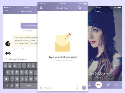 Image source: Dmitriy Goncharov
The design is the one element that can make a great difference in the decision process. For example, the New York Times is a publication that is worldwide recognized for its design (in comparison to the less popular New York Post).
The quality of the design also decides the overall quality of the website or application in question. You cannot hope to have a good design that does not look good.
The one thing that you have to pay attention to is that your design does not distract the user from the content that is actually present on the website. You need to maintain a perfect balance between these two aspects, using the design for all the benefits it can bring.
USING YOUR INTERFACE SHOULD BE A CHOICE
Image source: Balkan Brothers
No matter how hard you try, you cannot force users to actually use your interface. This should be their decision, your responsibility being to provide the actual pathways for the usage of the interface.
It is not your job to control the actions of the user; what you need to do is ensure that the interface you provide is simple and easy to use. Once you achieve that, you are guaranteed the necessary user confidence.
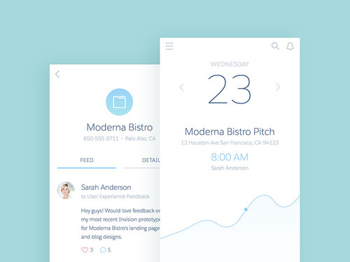 Image source: Thanh Quach
Achieving such objectives might not be as easy as you might expect. However, in order to build a usable interface, there are a number of elements to take into consideration.
Follow a number of standards: You have to ensure a number of elements that are standard, maintaining labels that the user has grown accustomed to and also ensuring interactions that are predictable.
Keep it simple: The user is interested in an easy browsing experience, so he/she should not be given too many decisions to make.
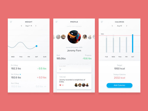 Image source: Dan Baker
Learning as part of the process: The user should be allowed to learn and accumulate information as part of the browsing process.
Feedback is important as well: Each and every interaction on your website should be accompanied by instant feedback. The message should always be clear, so as not to generate further confusion.
CONSISTENCY, A CONCEPT TO BE CONSIDERED
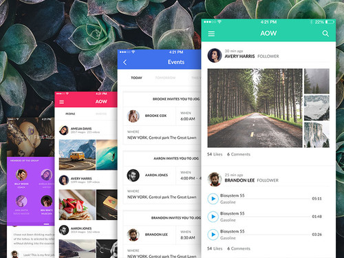 Image source: AOW Mobile iOS UI Kit
The consistency of the elements that are present on the screens is directly influenced by their behavior. In the situation that the behavior of various elements is the same, this means that the appearance should be similar as well.
Interesting enough, inconsistency is just as important for inconsistent elements as consistency is for consistent elements. Essential differences are often obscured by novice web designers through the application of consistent visual treatments (when a different visual treatment might have been more appropriate).
 Image source: Brandon Termini
Maintaining similarity is essential for the design process, including when it comes to the elements and interactions that are present on the website. What you need to do is to ensure that both actions and consequences are predictable, so that there is no confusion generated.
The user needs to experience and interact with elements that are consistent. Let’s take an example, in order to understand this concept a little bit better. If your interface requires the user’s input, you will only waste your time by adding various alert styles.
You have to think about consistency at all times, adding just one alert method. Keep the other two for the entry of data and also for results’ visualization. Consistency is unity.
A/B TESTING, A MUST
You might be thinking that A/B testing stands for “always be testing”. Even though this is not actually the case, it can help you to understand the importance of this practice.
The A/B testing refers to the fact that you will try out different designs for certain user categories, analyzing the feedback received after that.
This practice will allow you to find the answer to some of the questions you might have. For example, you can discover whether adding a bigger banner was worth it or not, as it increased the conversions. Or, you can find out whether the upgrade of the design actually had an effect on the social media interaction.
You can combine the information obtained through this practice with the one delivered through analytics, in order to discover the opinion of the users about your actual design. The early handling of existent problems will ensure a higher level of user confidence, which is quite beneficial.
It is clear that regular testing will guarantee that you keep up with the demands of the users, so make sure that you are consistent with such practices.
A FINAL WORD
 Image source: Alex Martineau
When you want to build user confidence, you have to build trust. Trust often comes from carefully made choices but also from features such as consistency and predictability.
When the user begins to feel comfortable in using your interface, that is the moment when confidence appears. The user should not be intimated by the interface, nor bothered by it. The interface that is trustworthy does not stand out, allowing the user to achieve the ultimate goal and that is to actually use the website (without appearing to be too much work).
Thanks to visualhierarchy