The blue color is trending worldwide. Here’s why.
How did humble blue go from having no name in the antiquities to being the world’s favourite and most used color?
How did humble blue go from having no name in the antiquities to being the world’s favourite and most used color?
Blue has become the most prominent colour in modern art, and a favourite for interaction design and social apps. How did the colour blue conquer the world and why?
Blue was named the world's favourite colour in 2015
Considering that the antiquities didn’t even have a name for the colour blue, it has gone on to become highly prolific in modern media and even being named the world’s favourite colour in 2015 (Ref1). Is media just going through its ‘blue period’ or is something stronger at play?
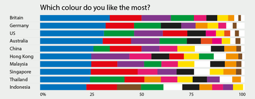
Data was taken from YouGov survey
Art
Martin Bellander scraped and analysed the colour of over 1000 paintings, downloading the painting catalogues from the BBC, Google Art Project, Wikiart, Wikimedia commons, and various museums. Read about his process and his full findings.
As well as a comprehensive evaluation, the most interesting conclusion is that art overall has become bluer.
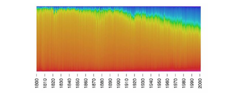
Graph from Bellander's study, showing the increase in the amount of blue used in art since 1800.
This trend may be due to a number of reasons, both physical and psychological. Including the introduction of new artist's materials, a decrease in the cost of blue pigments, the shift away from portraits or even a shift in consumer preference.
The rise of blue in the art world has also been matched by its rise in apps, advertising and print design.
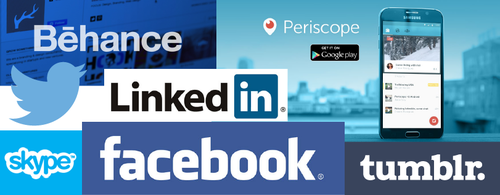
Social media
The most successful and world prolific social apps are all blue. The likes of Twitter, Facebook, Linkedin, Skype and Behance all chose blue to represent their brand worldwide, transcending cultures, different emotional associations, colour symbolism, gender preference and cultural beliefs.
Why is blue dominating?
Colour symbolism
Blue is frequently associated with openness and freedom, by association with calming elements like the sky and oceans.(Ref 2) It also has emotional associations of trustworthiness, calmness and interaction. These are associations that closely align to that of social apps and social brand values.
Colour priming in interface design
In the early years of the internet, links and communication were indicated by blue hyperlinks. So, people have become used to searching and interacting with blue cues, leading to colour priming on a mass scale. People are used to looking for elements that are blue as an indicator that they can interact with it.
Ease of viewing
=Blue is least affected by colour blindness, so the majority of the population can see it. Mark Zuckerberg who is colour blind, explained why Facebook is blue:
Blue is Facebook's dominant color, because, as he said, "blue is the richest color for me — I can see all of blue." (Ref3)
This is in contrast to the inability to distinguish the colours red and green, which affects 7-10% of men and 0.4% of women (Ref 4).
Blue is also considered a background colour (Ref 5), due to its cooler association. This means that people are happier to interact with the colour over a longer period of time, as it is less intrusive and easier on the eyes.
Psychology of blue
In terms of colour psychology, the main effect on behaviour is summarised by what is call the Regulatory focus theory. This is a goal pursuit theory, which differentiates peoples' perceptions in the decision-making process.
People can achieve their goals in two different ways, either with a promotion or a prevention regulatory focus (Ref 6).
- A promotion focus perceives goals as hopes and aspirations, so people openly approach things that match their goals.
- A prevention focus, on the other hand, perceives goals as duties and obligations, using a moredefensive goal behaviour.
Individuals more willing to interact and engage with things that are blue (Ref 7)
Zhu and Mehta analysed the effect of colour on cognitive performance and found that the colour blue initiates a promotion focus goal, so individuals are more willing to interact and engage with things that are blue (Ref 8). They also found that blue increased creativity and openness in interactions, thus providing the perfect psychological basis for social apps and interfaces.
Promotion focus also positively affects consumer behaviour (Ref 9), increasing persuasion when an ad or sales point features images that remotely relate to each other and to the product.
For these reasons blue is more favourable to consumer responses, across both art, media, advertising and app design.
Given the strong psychological backing of the world’s preference for blue, it isn’t going to fall out of favour anytime soon. So, if you want to design something that the majority of people can see clearly, openly and positively associate their goals with, that also affects their consumer behaviour for the better – start with the colour blue.
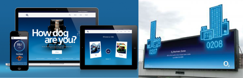
Example of O2's branding. Using blue to selling social interactions across print, online and OOH marketing
Thanks to laurendo