The value of consistent design
To many designers, consistency doesn’t scream sexy. But to anyone with an understanding of user experience, there couldn’t be a bigger turn on.
To many designers, consistency doesn’t scream sexy. But to anyone with an understanding of user experience, there couldn’t be a bigger turn on.
When someone visits a site for the first time, that’s a new experience. You can make the experience look and feel the same as others but, ultimately, it’s different because the core product is (hopefully) different. While I don’t believe in walking through the motions, the less a user has to learn during a new experience, the better.
We should design with this in mind.
Consistency makes users feel comfortable
Anyone who tells you their product was a success because of the intuitive design they created is overselling their skills. There’s no such thing as intuitive design. We are socialized to understand our experiences. Any “intuitive” design is simply a combination of signifiers and affordances we’ve come to understand from previous experiences.
We didn’t grow up knowing that a hamburger menu means more options. Heck, we didn’t even know it was called a hamburger menu until someone told us. Why would anyone unfamiliar with the concept ever assume that a stack of three lines is called a hamburger menu?
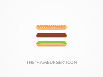
But the hamburger menu, like many other signifiers that we’ve learned over time, is a universally understood design asset we should use to our advantage.
I’m not saying we should copy and paste with no thought to it, but, as designers, we should definitely take the time to understand why something is designed the way it is, why it’s understood so well, and how we can leverage this knowledge in the products we create. It’s our job as designers to understand why something works and make it just different enough to be new and interesting.
Consistency saves time and money
I’ve written about how to create modular design before, and consistency is just another reason to do so. Modular design is consistent, and consistent design is modular.
When you have a consistent design, there’s no arguing about what something should look or feel like. This isn’t to say our designs should be inflexible, but there should be a defined reason behind the experiences we create.
“There should be a defined reason behind the experiences we create.”
Once we define a look and feel, it’s much easier to build off that core and adapt in the future while maintaining consistency. This means we spend less time in meetings and more time building. And when we sit down to build, it means spending less time trying to decide how to make things different for the sake of being different—and more time focused on building the product we envisioned.

Products need to be fun, enjoyable, and, at times, delightfully surprising. Over time, our products need to evolve. But all of our decisions should be rooted in reason in order to maintain consistency.
Beautifully consistent
Ultimately, great design is invisible because it’s consistent and familiar. Not because it’s mindnumbingly beautiful. And not because it’s an exact copy of what has previously been created. Great design is consistent and familiar because of an interesting combination of both.
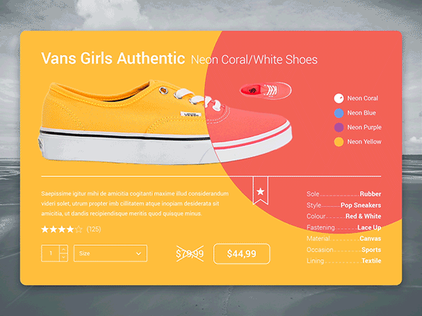
Image by Christophe Kerebel.
Beautiful consistency is a nod of respect to your users. It tells them you care about the ease of their experience but you also want it to be fun to play with and visually appealing as well. Creating beautiful consistency comes with a deep understanding of the fundamentals of design and the reasoning behind a user’s experience.
“Beautiful consistency is a nod of respect to your users.”
It’s our job, as designers, to make consistency sexy. That doesn’t mean exact replication. And that doesn’t mean making art. It means making people feel comfortable and delighted, simultaneously. Doing this well takes practice.
Win the war against boring
It’s absolutely fair to argue that consistent design can be incredibly boring. It’s also valid to say our internet is slowly turning into one big, bland space of Mobile First squares and rectangles in order to achieve consistency. And I completely agree.
“Great design is invisible because it’s consistent and familiar.”
But we can be consistent without sacrificing beauty—we just have to work a little harder to make it happen.
Image by Leo Leung.
Anyone can make a site of squares and rectangles consistent and Mobile First, but that’s not what you were brought on to do—and you know that. Ask yourself what you can do to give your product an edge. Challenge yourself to fight boring—every day. Your users will appreciate it.
How to be consistent
Consistency, while incredibly valuable, isn’t difficult to achieve.
Here’s a few tips from on how to make your design consistent:
- Introduce strong visual hierarchy, with the most important things big and bold
- Align everything nicely along the grid, or introduce any other kind of visual order
- Use a consistent color scheme throughout the app
- Keep the navigation consistent across all screens
- Re-use the same elements for different situations. For example, design a sample notification and color-code it for different situations.
- Consistency and structure will help the user feel at home
Consistency should be built into the foundation of any design. Only the best designers will recognize what’s been done, but everyone who enjoys the product will appreciate it—whether they notice it or not.
Thanks to invisionapp.