Typography trends for 2018
From custom type to colour fonts, leading designers forecast the biggest type trends of 2018
Typography trends – like graphic design trends, or colour trends – rarely appear out of nowhere. Instead, they evolve and grow as they move from the niche towards the mainstream. That's why, to forecast the big typography trends of 2018, we're first taking a look back at the biggest type movements of 2017.
Some of the top names in type to share their thoughts on the biggest typography trends of 2017 – as well as their predictions for what will be hot in 2018. Here's what they said...
01. 1970s-style serif fonts
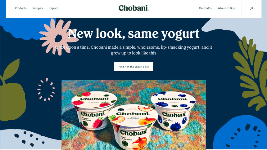
Chobani's new look brings warmth to fonts
"One typographic trend that I predict will be popular in 2018 is the use of warm, 1970s-evoking serif typefaces," says Jeremiah Shoaf, a freelance designer and founder of Typewolf. "I think this is a reaction against the cold, sterile neo-grotesques like Helvetica that seem to be dominating the design landscape."
Shoaf comments on the recent Chobani rebrand as a prime example. "Its new bespoke typeface has a retro charm that brings to mind ITC Clearface and Bookman, two typefaces that will forever be associated with the good vibes of the 70s," he adds.
02. Retro reactions to geometric type
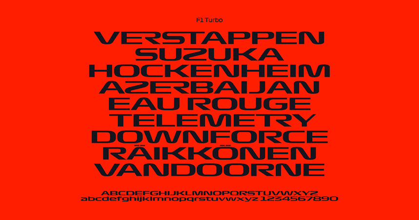
Could we be seeing more retro fonts like 2017's Formula 1 rebrand?
"2016 was all about geometric sans typefaces," says art director Rick Banks. "This carried on to some extent in 2017 – as in the Moonpig, Sky Sports rebrand – but much less so. This year we have seen an increase in serifs, as with the Southbank Centre, Chobani, and Medium rebrands).
"I think next year we'll see designers reacting more against geometric type . I think brands will want type with more character and standout value. It wouldn't surprise me if we see more 90s-inspired typography – following on from the new F1 logo."
03. Colour fonts
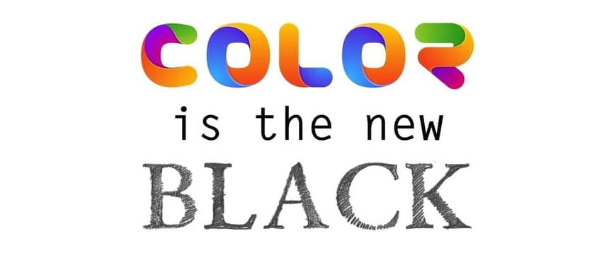
Black is so last year
"I think colour fonts (see FontMaker by FontSelf) will be a big hit in 2018. The user-friendly interface and the possibility of adding colour as another dimension to typography represents a huge opportunity for designers and brands to add identity to their designs," says typographer Alex Trochut.
"The fact that not only Illustrator but also Photoshop will support colour fonts opens up a door to create photographic typography, which represents a whole new canvas to play with. I'm very excited to see what are the good results coming out of this new technology."
04. Custom fonts designed in-house
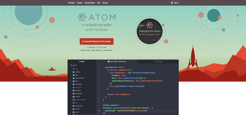
Text editors like Atom are popular with coders
Dalton Maag founder and type designer Bruno Maag agrees with Banks. "Geometric sans typefaces continue to dominate the typographic landscape, but we can see a trend toward more condensed designs with a grid-like structure," he comments. "It seems as if there is a resurgence of 70s inspired type, too."
Maag also mentions a rise in the use of open source fonts in digital environments. This is thanks to a dramatic improvement in quality over the past few years, as well as the potentially considerable cost savings – and means designers can avoid navigating the complexities of licensing for digital usage on a number of different devices. "However, it does limit the role type can play as a brand tool," says Maag.
He continues: "We can see in-house design teams increasingly championing custom font solutions to close the gap between brand expression and controlling technical and logistic aspects of font usage. A further trend in [custom] type is to involve scientific research on aspects of accessibility, with designers having to concern themselves with science."
05. No trends
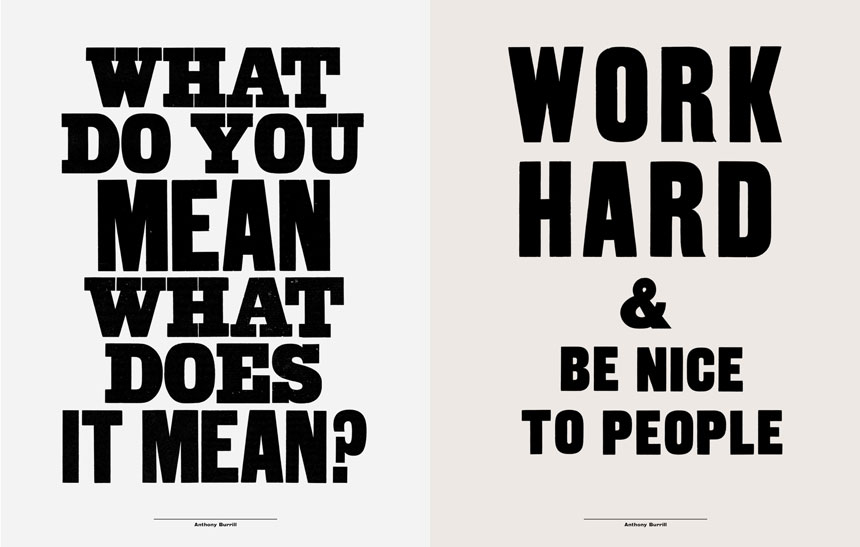
Anthony Burrill urges designers to forge their own route
"I don’t think there are typographic trends any more; if there are, I find it hard to identify them," says designer and print maker Anthony Burrill. "Depending on who you follow on social media – type foundries, designers, lettering artists, graffiti artists – there are numerous trends that simultaneously coexist. Scroll through your Instagram feed and you’ll see historic type examples rubbing shoulders with the latest type animation techniques."
He acknowledges that this can be overwhelming, but offers some solutions to help you out. "It's possible to navigate your way through this visual avalanche. Seek out work that you connect with. By gaining more in-depth knowledge, it’s possible to have a meaningful relationship with type design, rather than being dazzled with the latest techniques.
"Seek out work that informs your own work and inspires you, and use it as a launch pad for your own creativity," he continues. "It's important to stay informed and have an opinion about work by other designers, but even more important to develop your individual response and approach to work."