Use Google Analytics to build a smarter mobile website
Countless helpful and not-so-helpful articles proclaim the rise of mobile, but what practical steps can you take to make your brand more approachable for mobile users?
Mobile first! Responsive design! You’ve heard all of the buzzwords and catchphrases. Countless helpful and not-so-helpful articles proclaim the rise of mobile, but what practical steps can you take to make your brand more approachable for mobile users?
When arguing a case to make a website mobile-friendly, abundant evidence exists to present to the business owner, such as the Pew Research study that shows that 56% of US adults carry around a smartphone. However, while general statistics are useful for demonstrating the value of designing with mobile in mind, they don’t provide the guidance necessary to understand precisely how users will interact with a particular brand on their phone.
Frequently, design and development teams will be asked to redesign a dated website to be responsive. Looking at existing data would provide crucial insight into how best to present information to mobile users. Google Analytics offers a number of free features for incredibly detailed analysis of mobile activity, with the ability to easily compare to desktop activity.
If you haven’t yet installed Google Analytics, setting it up is easy. Just create a free account, and then Google will walk you through the process. You’ll need to place a tracking code in your page before you can start to collect the sort of data that we’ll review in this article.
Analyzing Mobile Visits Via Reports
The standard reports are where most people browse in Google Analytics. Let’s look at the most important ones for mobile activity.
1. OVERVIEW
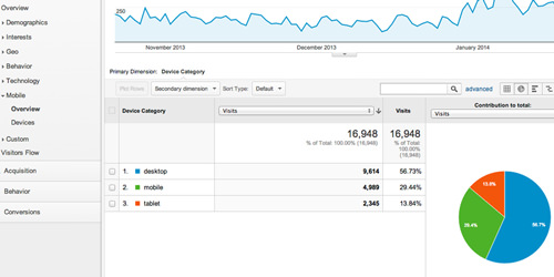
This report breaks down visits by mobile, desktop and tablet. It’s helpful for quickly seeing high-level statistics, such as what percentage of visits are from mobile devices.
When clients question the value of making a static website responsive, I find that simply showing them how many mobile visits they’re getting often helps to convince them. If the experience of a significant portion of users is less than optimal, then the owner should realize that it’s time to take their needs seriously. In my experience, desktop activity accounts for only about 50 to 60% of visits, with mobile and tablet combined making up the rest (close to half!).
However, a development and design team should dig deeper than just an overview. This is where the “Devices” report comes in handy.
2. DEVICES
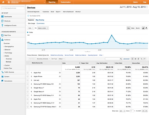
This report breaks down statistics into the specific devices that people use to access your website. The details here can help you pinpoint problems with usability on a particular phone, tablet or mobile operating system. For example, if the Galaxy S III shows a significantly higher bounce rate than the iPhone, then you might want to compare how your website appears on those devices.
While viewing the report for a local service-based business whose website focuses on lead generation, I saw significantly higher conversions from iPads than any phones in the list. Simply cramming the desktop website into a smartphone browser did not give users a positive experience with the lead submission process. However, at the tablet size, the website was still large enough for visitors to use the form easily enough.
As someone who manages online advertising campaigns, I generally find the opposite to be true, with tablets converting at a lower rate than phones. These statistics, then, reinforced the need to improve the mobile experience to bring phone conversions up to par. With a responsive layout that eliminates the need for the user to “pinch and zoom” to fill out the form in their phone’s browser, the website would perform more effectively.
But this report doesn't stop with a list of devices. You may also select various dimensions across the top to review factors such as screen resolution and operating system. Reviewing the most common screen resolutions of visitors will help you to plan the breakpoints of a responsive redesign. You can also flag an excessively high bounce rate or a low time on site for a particular resolution, which might be the result of content getting cut off at that size.
3. BROWSER & OS
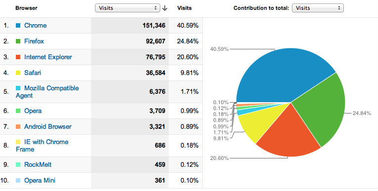
This report shows the main browsers being used to access your website, and it also highlights trends — for example, whether the default browser or Firefox is used more on Android phones. Also, you can view statistics by operating system and even add a column for operating system version.
The report could also reveal how much effort you should put into making the website backwards-compatible. For instance, when reviewing statistics for an engineering company’s website, our development team found a significant number of visitors still browsing in Internet Explorer 8 (probably in offices whose IT departments are still debating whether to upgrade from CRT to LCD monitors!), with only a small percentage coming from mobile devices. These results helped to focus us on making the website usable on old systems.
Creating Advanced Segments
While the main reports provide plenty of helpful information, advanced segments enable you to drill deeper into useful data on mobile visitors. You can set up segments to distinguish between mobile, tablet and desktop visits, and even segment more narrowly by screen size and device.
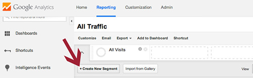
To view advanced segments, make sure you’re in the “Reporting” tab in your Google Analytics account. Near the top of the screen (between the graph and the menu bar), click the drop-down arrow beside “All Visits.” A menu will appear allowing you to view existing segments and create new ones. In the “Built-In” segments, you should be able to select the default ones for “Mobile Traffic” and “Tablet Traffic.”
However, you’ll want to create a segment just for desktop traffic (because the only built-in option lumps desktops and tablets together).
Select “Create New Segment” and, in the new menu that appears, choose “Technology” in the left sidebar. Scroll down to “Device Category” and enter “Desktop.” Then, save the segment so that you can use it in your account.
You can apply advanced segments to reports throughout Google Analytics interface. I frequently use these when reviewing statistics in general, because user behavior on mobile differs so much from on tablets and desktops. In addition, when troubleshooting a spike in bounce rates or some other problem, I’ll often use these segments to determine whether the problem is specific to a device type. Below are some useful reports to review when filtering down to mobile traffic.
1. PAGES
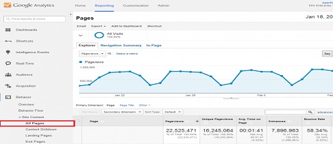
Here , you can determine the top pages viewed by mobile users. This information is valuable for planning which navigation elements to include on mobile and for identifying any important pages that mobile users are not finding. In addition, comparing the top pages on desktop and mobile will yield insight into the different goals of each user type. For instance, a desktop user might browse heavily through your product inventory, while a smartphone user might just be trying to find an address to your nearest location.
2. EXIT PAGES
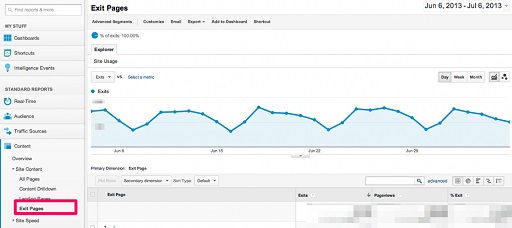
This report shows the last pages people view before leaving the website. When you've filtered down to a mobile segment, review the top exit pages and determine whether any mobile-specific problems are hindering visitors from completing the desired goal.
3. VISITORS FLOW
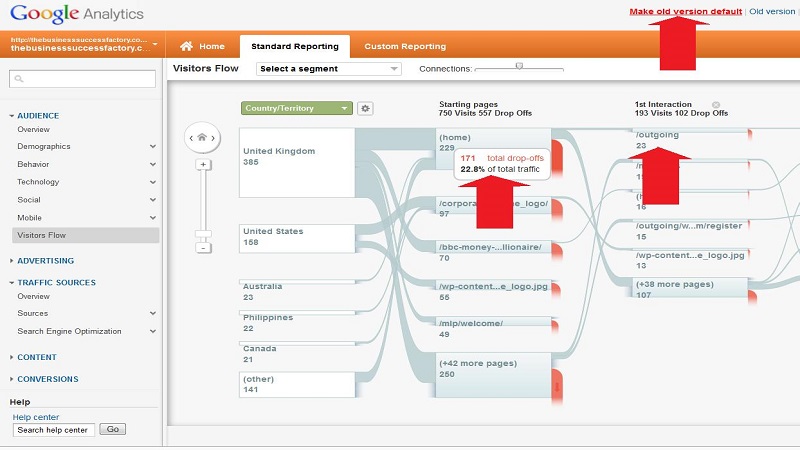
This report shows the top paths people take through your website. Again, comparing mobile and desktop behavior should help you to decide which pages to make most prominent at each size.
On one website, I found that the “About” page was one of the most common pages for users to visit on desktop. However, on mobile, the page was much lower down in the list, because the link to it was in a navigation bar that was barely noticeable on a phone.
4. TRAFFIC SOURCES
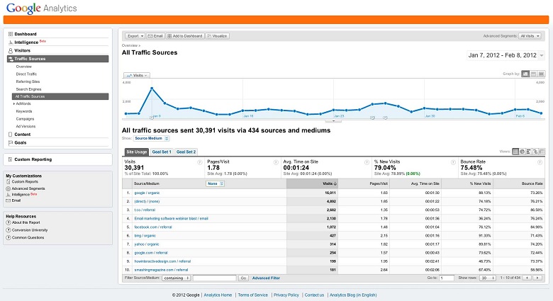
This report shows the top sources through which people arrive on the website. Comparing the mobile and desktop segments here will show whether any particular source skews towards mobile users. I’ve often noticed a higher percentage of traffic coming from Facebook on mobile than on desktop, because so many people access Facebook via a smartphone app. This awareness can help you to tailor your messaging at mobile sizes to people who have discovered your brand via social media. For example, if it’s a blog, make sure that the social sharing buttons are visible and functional on mobile.
In addition, this report can help you to diagnose problems with search engine indexing on mobile. In 2013, Google announced stricter regulations and penalties for websites with a poor mobile experience. If your organic traffic is steady on desktop but extremely low on mobile, then you might want to look for factors that are penalizing you on Google, such as Flash video or faulty redirects that take users from a subpage to the home page.
Act On The Data
If you have access to the Google Analytics account for the website you’re rebuilding, then you’ll have plenty of material to inform the design and development decisions. Take the time to review that data!
If you need to defend the value of making a website responsive, start by finding the percentage of recent visits from mobile and tablet. Move on to devices, browsers and screen sizes to decide which elements to include in the navigation for mobile. And use top pages, visitor flows and traffic sources to determine which content to make most prominent and how to guide users through the website at each size.
The most dangerous decision to make when planning any website is to ignore data about your audience. Any business that neglects to provide a friendly Web presence for mobile users will likely lose out on revenue to competitors who are doing it right. Design, development and marketing teams have a responsibility to use all of the data at their fingertips to guide decision-makers to make their websites work for a mobile audience.
Thanks to smashingmagazine.