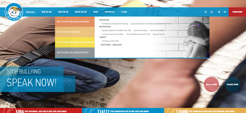
10 website navigation trends for 2017
I’d like to share the top 10 emerging navigation trends that’ll keep growing well into 2017.
We take a look at the navigation elements that are making UIs easier to use this year.
Over the past year we’ve seen a lot of growth and new trends in the world of web design. And I’m noticing a lot of new trends emerging in 2017 as well.
I’d like to share the top 10 emerging navigation trends that’ll keep growing well into 2017. These nav trends all work well for different types of websites, so there’s a lot of variety here to pull ideas for your next design project.
01. Fixed scrolling navbars
Navigation is made to help users get from point A to all other points on a site. And by keeping the nav menu in a fixed place it allows users to navigate the site from any location on the page.
This has gotten easier with CSS and jQuery plugins and more themes come default with the fixed navbar. As more websites pick up on this trend it’ll keep growing and likely become a staple of modern web design.
Consistent navigation and usability are both important. But the fixed navbar is also handy for mobile users so they don’t have to swipe back to the top just to browse further into a website.
Why use them?
If you have a site with lots of navigation items then it’s a good idea to keep it fixed. It’s a surefire way to keep visitors on the site for longer and increase total pageviews.
However make sure the navbar doesn’t take up a considerable amount of space. It shouldn’t be so large that it blocks major portions of the page content.
As long as the user can still consume the page content they’ll probably benefit from a universally accessible fixed navigation.
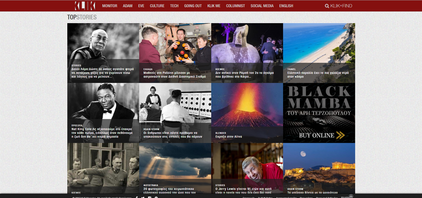
02. Mega menus
The mega menu has been popularized with the increase of magazine-style blogs. They differ from normal dropdowns because instead of just flowing down vertically these mega menus expand wider, usually containing multiple columns of content.
In the example above, Hamogelo uses different columns for recent stories, related categories, and other links to the site all in one dropdown.
This technique works well if used judiciously but it’s not great for every site. In fact it’s really only useful if you have enough content to justify a mega menu. They look best when filled up with content.
Why use them?
Visitors can get a sense of your website by skimming through related content. If you can provide more content in a mega menu then why not?
This trend does not work on mobile since there’s no room on the screen. But plenty of people still browse the web on desktops & laptops so there’s a wide audience out there in support of the mega menu.
Every site is different so feel out each project and see if a mega menu could work well or not.
03. Universal navigation
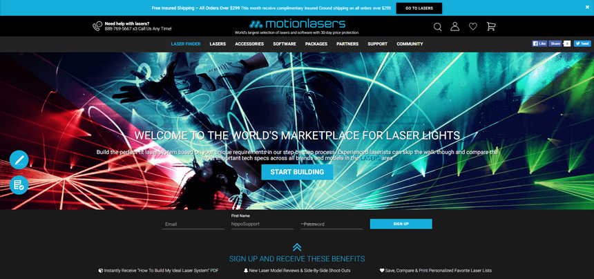
Some companies work with or own multiple brands. If these brands aren’t related then there’s no reason to connect them.
But sometimes it makes sense to include a large universal navigation across an entire website. Look at Motionlasers for example and especially at the filters that was the need to navigate amongst multiple brands with different set of features.
It makes sense to keep this universal navigation on every page to draw attention to other things created by the company.
Why use this?
If you’re working with a larger network of products or brands then it can only help to link them all together. A universal navigation can drive visitors across the whole network to help interchange between different audiences.
Granted this only works well for a large network so you’ll need great products/websites.
04. Vertical sliding navigation
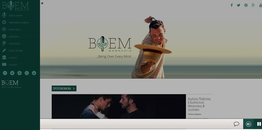
Very few websites follow the vertical navigation trend. But when it works it really works well. Usually you’ll spot this on portfolios or creative agencies that push the boundaries of traditional web design.
But I have seen it used a lot more frequently in recent years, and I expect this trend to keep growing well into 2017.
The example above from BOEM Radio is a fantastic case of using the vertical navigation while keeping it visible at all times. Icons link from the side so you can click an icon instead of the hamburger icon.
It’s an experimental approach to navigation design but it can work on creative-oriented websites.
Why use this?
Only try this technique if you’re going for a fullscreen layout that moves away from a traditional grid design.
A working vertical navigation isn’t easy to create from scratch. It’s also tricky to get it working in responsive designs. However if you’re curious to experiment and willing to try new ideas then vertical navs can be a refreshing twist on traditional websites.
05. Globally hidden menus
Every web designer should know about hamburger icons and their use in responsive design. But I’ve noticed a recent trend where blogs and larger websites keep the navigation hidden from view at all times.
This may seem strange because it doesn’t help the visitor find links quickly. However it does clear up space on the screen by removing the navigation from sight.
There have been various studies that indicate most users struggle with hidden menus. But this trend may be changing with more people using smartphones and growing familiar with the hamburger icon’s significance.
Why use them?
The best case scenario for a globally hidden menu is with a tech-savvy audience. These visitors recognize the hamburger icon and they know it means “click here for menu”.
So if you’re designing a tech blog or creating a B2B digital agency then this can work. But for all general scenarios I’d recommend skipping this trend unless it really complements the interface.
06. Responsive subnav menus
There’s no way to avoid mobile responsive navigation. It’s popular and it’s here to stay. Many designers try to hide some navigation links on mobile to help the menu fit nicer on small screens.
But many sites are following a new trend of keeping all navigation items by using dropdown menus. This usually requires a hamburger nav with toggle icons for link dropdowns.
You’ll only see this technique on mobile screens or in small browser windows.
Why use them?
Visitors should have access to browse your entire website regardless of what device they’re using. By keeping the sub-menus in place you can offer a much better opportunity for visitors to browse around.
Just make sure that each sub-menu is clearly denoted with an icon, color change, or something visual. Visitors should know if clicking/tapping a link opens a menu or brings them to a new page.
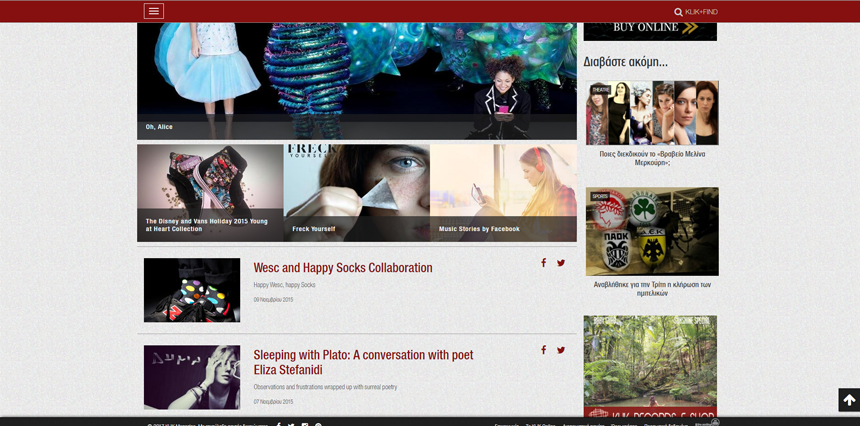
07. Top stories carousels
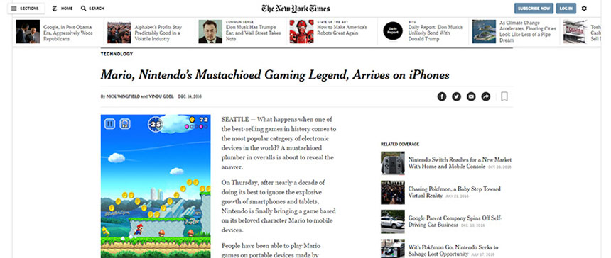
The New York Times uses a thumbnail gallery at the top of every post as a lead into their more recent content
This trend is becoming more popular on blogs and high-volume news sites. Many of these larger sites can publish dozens if not hundreds of new articles every day.
By adding a simple carousel to the top of the page it offers visitors a chance to check out the latest articles. These stories can be curated or updated dynamically, and they can be styled with thumbnails or whatever you like.
You can see another example on basically any Vogue article with a slideshow gallery at the top.
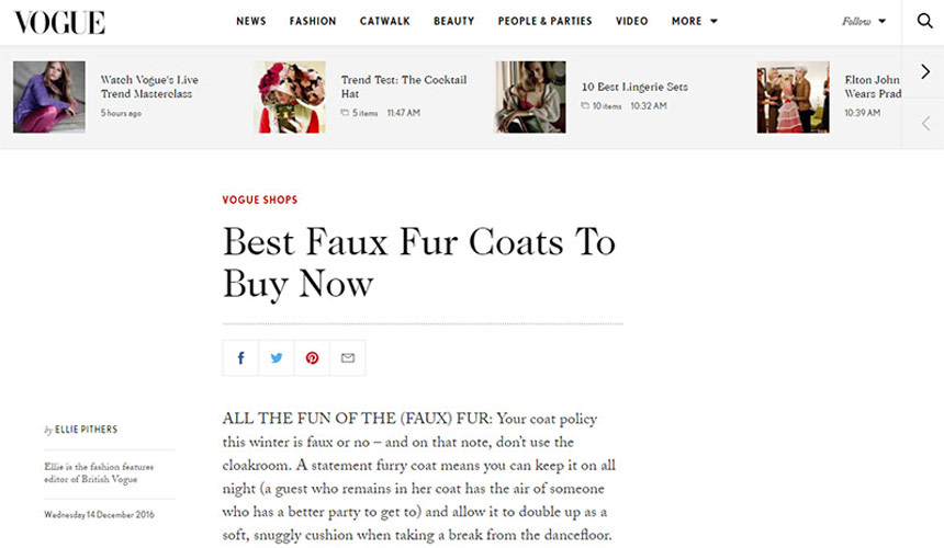
Screenshot of Vogue’s page layout with slideshow gallery of recent stories
Why use them?
If you’re designing a blog with high volume content then this trend can do wonders for the user experience.
Visitors can find out about recent stories and it’ll increase the average total time on site. Most blogs that publish lots of content want to increase visitor retention and the article carousel is a surefire way to do this.
08. Table of contents
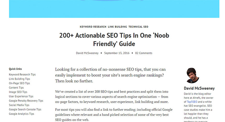
A screenshot from the Ahrefs blog with fixed “quick links” attached to the side as a table of contents for the post
Google seems to love longform content and it’s driving writers to publish lengthier guides on practically everything. This works great for web content but it can muddy the reading experience.
Recently I’ve noticed more table of contents boxes added into longer articles with defined sections. The most notable example is Wikipedia which has been using a ToC since inception.
But you can see other examples on sites like The Sweethome which include ToCs in many of their longer reviews.
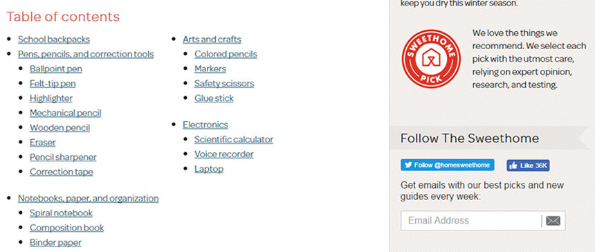
Example of a very simple table of contents used on The Sweethome
Why use them?
The biggest reason to use a table of contents is to improve the user experience. Longer articles are becoming the norm and it can be intimidating to land on a 5,000+ word article. A ToC reduces that intimidation factor.
But they’re also useful in SERP rankings since Google can offer jump links based on a table of contents. This is a win-win for everyone!
09. All-caps corner links
This is a subtle navigation trend but it’s been spreading rapidly over the past few years. It seems like every startup and professional business uses the all-caps text style to create a navigation that feels intuitive and symmetrical.
These navs usually follow very similar styles:
- All caps
- Small lettering
- Sans-serif fonts
- Extra horizontal spacing
- White or very light hue
This design trend has become the signature style for a clean, crisp, and professional-looking navigation.
Why use them?
I don’t have a better name for this trend other than “all-caps links” because that best describes their style.
An all-caps navigation menu just looks professional. It’s subtle yet noticeable and it gives off a sense of trust to the user.
If you’re designing a startup or corporate website then this trend is probably the best design style to follow for your navigation.
10. Single page dot navigation
The rise of single-page websites and single page apps has driven many new trends into the limelight. One of these trends is the dot navigation: a series of circular icons located on the left or right side of the screen.
Each of these dots represents a different section of the layout. And since the layout is one long page these links scroll up or down based on the user’s current position.
I really like the ingenuity of this trend, but I also despise it’s lack of clear UX. Most users won’t know what these dot icons mean or how to use them. But as they become more prevalent I think this trend will catch on and become somewhat of a norm for single page layouts.
Why use this?
If you’re designing a single page layout then I’d recommend trying to use top navigation links with text. This makes it easier to see what each slide represents and what sort of information is on the page.
But if you can’t(or don’t want to) use a top navigation then these dot features are the next best thing.
Or even better: combine both! It’s possible to have a top nav with text links and include dot navigation icons too. Or even include text beside the dots. Lots of options to choose and they can all work well.
Conclusion
The web moves fast these days and I always expect new design trends every year. Some of these trends have been around for a while, others are just starting to emerge and flourish.
But you can bet that all of these nav trends will continue to climb and gain popularity among designers well into 2017.
Thanks to Creative Bloq.