What is a landing page?
They’re laser-focused web pages on specific topics that help to (a) bring in more visitors or (b) convert visitors into leads and sales.
Results are what differentiate a landing page from every other page on your site.
They’re laser-focused web pages on specific topics that help to (a) bring in more visitors or (b) convert visitors into leads and sales.
The trick is moving beyond the visual aesthetic or design to make sure all the proper elements appear correctly on each page. We’ll cover these important pieces, and then dive into explaining what you should consider testing (and why), to increase your return on investment (ROI).
A Landing Page Defined
By it’s widest definition a landing page is any web page that someone can "land" on. That's a bit too broad to be helpful to us though. But, in the context of your small business marketing campaigns we can narrow this definition down considerably.
Within your campaign, a landing page is a single website page that is designed with a narrow purpose. The goal is to limit the options a visitor to your landing page has and direct them to a clear objective. Landing pages have their navigation and other distractions removed. They appear as standalone pages on your site.
The purpose of a landing page is to further your marketing or sales goals. Example are:
- Click-through landing pages - that engage your users, warm them up, and then direct them to your eCommerce products to make purchase from you.
- Lead generation landing pages - which have the goal of directing users to sign up for a newsletter or fill in a form, usually in exchange for a free ebook, consultation, or trial.
A landing page is where you point your online ads and marketing links to. It's where you direct your potential customers. Landing pages are optimized for conversions, meaning the leads you send to these pages give you a better return. Higher conversions means more signups and more sales for your business.
Landing pages are important part of your online marketing strategy. Are you eager to add landing pages to your site? Or, if you already have a few landing pages, you may want to consider expanding on the strategy by adding more?
Why Your Website Needs (More) Landing Pages
Companies who increase landing pages from 10 to just 15 see a 55% increase in lead generation, according to a HubSpot report that analyzed the effectiveness of marketing benchmarks for 7,000 small businesses.
So, more landing pages leads to larger results. It's a scalable strategy. But keep in mind, these landing pages shouldn't exist by themselves. They are part of a system that works together.
How Landing Pages Work
Each landing page is one component of a larger sequence of pages, where a visitor sees a Call to Action (CTA) or message (from your website, email or ad) and arrives for a specific reason.
Here, information is delivered according to the same CTA that generated the initial interest (known as ‘message match’), and provides some way to exchange information for the offer. The end of the sequence is a simple ‘Thank You’ page, letting visitors know that you’ve successfully received their information and alerts them to where or when they can expect the offer.
Benefits of Landing Pages
Landing pages provide the opportunity to increase 'content specificity', which can also help increase your organic search (or SEO) performance, becoming a highly sought after resource for niche or ‘long-tail’ topics.
Pay Per Click (PPC) performance can also improve because you’re able to accurately match an ad’s value proposition and messaging directly with what visitors are seeing on your page.
Sales-focused pages get the added luxury of being able to expand on concepts, using storytelling that’s critical to persuasion. Typically that includes expanding on a value proposition or unique selling proposition. Also, providing supporting material like images or video, which can show the product or service in use. Then following up with credibility indicators like testimonials, seals of approval, and more.
Last but not least, dedicated landing pages also give you the ability for experimentation. You can test messaging to see which performs best with your audience. Or you can test product demos or ways to position your services against competitors.
The best part about this type of experimentation is that it allows you to test on a small scale, discover what works and what doesn’t, and then bring that information to the rest of your site or marketing materials.
Now that we know what landing pages are and why they are so effect, let's review how you can get started putting them together.
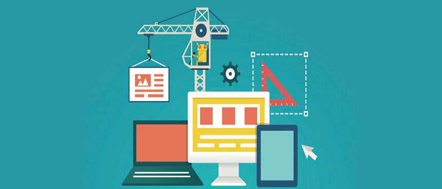
5 Ingredients of a Good Landing Page
Whether we’re talking about a lead generation page for your consulting agency, or an eCommerce product, it all starts with getting the ‘essential ingredients’ together to give your landing page the best chance at success.
1. Page Design
First and foremost, is distraction-free design. As previously discussed, people are visiting this page for a reason. So keep it at that! Have one primary goal, and one primary message on the page, without a lot of extra elements that distract people from signing up on your form or hitting the Purchase button.
Removing menu links and navigation help to focus the user on the most important page elements by reducing the options they can take. While in some cases it’s fine to add another link or two, the point is to try and keep things as straightforward as possible by limiting available options.
2. Headlines and Value Propositions
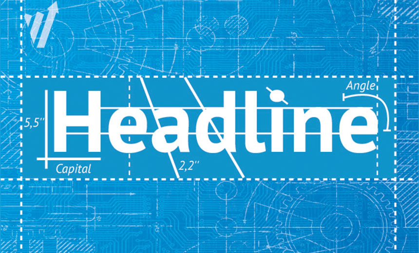
Headlines are really concise value propositions in disguise. The idea is to boil down what your product or service offers with a simple, straightforward message—one that focuses your main benefits or differentiates your selling points.
Another way to create this is to think about what people get from your product or service. That means the outcomes or end-results, which can be perfectly summarized with a case study or testimonial where a happy customer helps prove your case for you.
3. Images and Video
Your ‘hero’ image or video is just that: it expands on the value proposition by showing what the visitor could get or look like with your product or solution.
Think about some of the best commercials, like a Nike one, where the person is running up flights of stairs and seemingly conquering all evil. Incorporating compelling images and inspirational videos also help make the intangible concrete for your visitors. It’s not always easy to explain, in written text alone, how your services benefit people. But a simple story (similar to many explainer videos) can help crystalize exactly what you do, and why your solution is so valuable.
4. Calls-to-Action
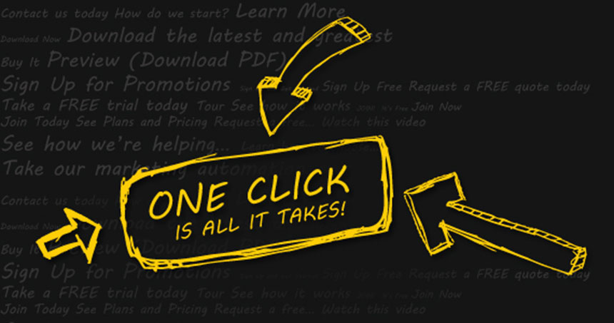
Calls-to-Action should be big, obvious, and compelling. Sticking with the theme of reducing cognitive stress, it should be immediately obvious to everyone what they’re supposed to fill out or where they’re supposed to click.
One of the important, yet often overlooked, aspects here is how you use design to help differentiate between multiple CTA’s on a page. For example, the ‘primary’ action you want someone to take should be more noticeable and emphasized on a page, while a ‘secondary’ action can be deemphasized with placement or maybe a text link (as opposed to a big button).
5. Credibility Indicators
You know that what you offer has value. But how do other people know that?
The best way is to use third party validation, so that you’re not just making the same baseless claims as the rest of your competition.
That means incorporating customer testimonials that illustrate the benefits customers have seen, logos of prestigious clients you've worked with, awards that you’ve won or press that has lauded your work, or case studies that show a certain percentage improvement other clients have gained. You can even use the corporate locations and number of customers you have as a way to demonstrate that your operation is first class.
What to Test? And Why?
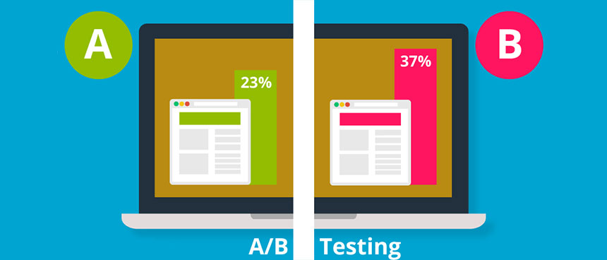
Now you’ve got a beautiful landing page setup, and are ready to start A/B testing... right?
Unfortunately, not so fast.
Testing is all about context. That means before running off to test button colors, you first need to figure out:
- Who’s coming to this landing page?
- Where are they coming from?
Believe it or not, the promotional channel or source of a visit has a huge bearing on what you’re going to want on that page.
Considering this information outside of the landing page you’re working on will help provide some extra insight to know how a landing page should look, feel or sound.
Here are a few elements that you can test based on this new found understanding.
1. Layout
Knowing ‘who’ and ‘where’ helps guide structural decisions like the actual layout of each landing page.
For example, let’s say someone is relatively brand aware. You know that, because they’ve been on your email newsletter for some time now and have some familiarity or trust with you.
That means your best bet is a really short page that cuts to the chase. You don’t have to be overly clever with copywriting to try and beat them over the head with a sales offer. They know you, they trust you already, and they understand you. Just a simple direct question or offer will get the job done.
Now compare that with somebody from an AdWords campaign, who’s not brand aware and has no idea who you are. They don’t know if your products are any good.
These people probably need a very long landing page. They might be more interested in additional videos and more customer testimonials and really strong supporting documentation or supporting evidence to show that you can do what you say you can do.
2. Messaging
Figuring out who you’re talking to is critical if you’re going to begin testing messaging and copy. That’s because different people—even within the same organization—might have vastly different motivations or messaging preferences.
For example, in one complex B2B transaction, you might be dealing with:
- the engineering lead
- a marketing or sales lead
- a CEO
The engineering lead is focused on specs and features. Marketing and sales might be more interested in hearing about website traffic or leads generated. While the CEO only cares about how much revenue was generated. They don’t care about technical specs. They don’t care about traffic figures.
The messaging and copy for these landing pages will differ and change drastically based on who is seeing this page.
3. Tone
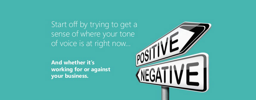
Headlines are vastly important. But don’t neglect the tone behind your headlines.
Building on the last point, generally the more brand aware someone is (or the more trust they have with you), the more you can focus on what someone stands to gain, from your solution. Companies are generally pretty good at incorporating positive messaging.
However negative messaging tends to be more impactful, especially at the beginning of a relationship with a prospect or a website visitor who’s less brand aware. Typically this means helping people protect themselves from an external threat in their lives. Or helping them uncover the internal mistakes they’re already making.
Focusing more on what people might be missing out on or what people might be losing, as a fundamental primal motivator, tends to help you cut through the clutter and get more attention with people who aren’t as aware of who you are, or what you do.
4. Visuals
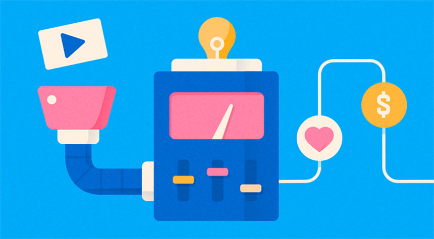
The visuals you’re using (or not using) on a landing page can have a huge bearing on the overall conversions.
Start by ditching dated stock photography—the kind that obviously looks like stock photography that shows up on every other site in your industry.
Videos are worth their weight in gold, but be careful. Video requires a careful coordination of a good script, delivery of your message, lighting, sound, and at least some basic production values.
5. Calls To Action
Last but not least, analyze the types of calls to action you’re using.
For example, if you’re using a form, how many fields do you absolutely need in that form? Generally speaking, shorter forms with less fields have higher conversions. But if you’re trying to generate a sales lead, then intentionally making them longer so you can better qualify each lead is a smart choice.
If you’re using simple text links or buttons, focus on the language you’re using. Words like ‘submit’ tend to have a negative connotation (stemming from the word ‘submission’). And instead of a basic word or two, try incorporating something that’s action-oriented. Here, verbs like ‘get’ or ‘download’ help tell the reader what to do.
Create Landing Pages With Purpose
Today’s websites aren’t static, information brochures. They exist for some purpose, and typically that’s to help you generate awareness, pull in potential leads, or engage new customers.
Landing pages are an essential ingredient of your marketing, helping to provide a very specific offer to a very specific person. They can inform, persuade, motivate, and satisfy visitors by delivering a useful solution to a painful problem.
Want better results? Start by creating more landing pages. Incorporate the basic elements and other best practices listed here.
Then to optimize, try to take a step back and understand the bigger picture by analyzing who’s coming to your site, and where they’re coming from. Seeing the entire customer journey from beginning to end will ultimately help you make better decisions of what to create, or test, on each page.
That way, instead of obsessing over how your landing pages look. You’ll focus more on how effective they are.
Thanks to tutsplus